07.27.15
NIvea - and its parent company Beiersdorf - have been battling over the use of its trademark color, Nivea Blue in a patent infringment case. Last week, the Federal Supreme Court of Germany said that Nivea's registered color trademark, NIVEA Blue, will remain. This reverses a 2013 decision made by the Federal Patent Court to delete the trademark color.
But the battle continues - the next step is for the team at Beiersdorf to head to Federal Patent Court.
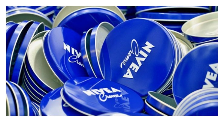
Beiersdorf board member Ralph Gusko commented, "Since 1925, the color NIVEA Blue, as it is used on our legendary creme tins for example, has stood for the brand values: Trust, Closeness and Care. It is the "face" of the brand and the foundation for the global design language of Nivea products. Its wide use over a long period and across the brand portfolio has ensured that consumers around the world associate the characteristic blue with the absolute highest skin care competence. For this reason we will spare no efforts in protecting the iconic color image as well as all other brand and design rights." says Board Member Ralph Gusko.
The color NIVEA Blue was first introduced in 1925 by the Beiersdorf's head of advertising at the time, Juan Gregorio Clausen.
The Creme tin was still oriented on the Art Nouveau style popular at the turn of the century, but Clausen went for a more modern look with the tin's new design and now iconic color. According to the brand, perhaps Clausen chose "the colors of the sea and the sky" because he was a former sailor. Whatever the reason, today Nivea's global identity is dependent upon its signature blue, which has a "very high recognition value," the brand says.


