 |
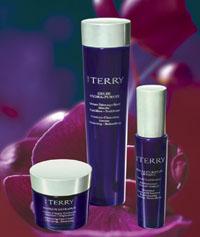
| Elegant simplicity was key for By Terry, who used DieterBakic’s packaging for three of its products. |
paradox exists in decoration trends. Companies are looking for bright colors, texture, anything that attracts attention. But they’re also looking for fewer colors, matte finishes, anything that relays simplicity.
“There are two ends of the spectrum. One is instant visual impact, which dictates brilliant colors, a lot of process work, and many colors on the container. The other is the crisp, clean, two-color, almost pharmaceutical look, using one pass of a silk screen and maybe a stamping pass to keep it crisp, clean and smart,” said Bob Smith, director of package development and purchasing for Cosmetic Essence Inc., located in Holmdel, NJ. “There’s not a lot in the middle.”
Whatever the desired look, the proper decoration can propel a stock or standard container into a custom piece that enhances brand image.
For Luxury skin care and cosmetic brand By Terry, simplicity was the objective. The company used standard packaging from DieterBakicEnterprises for three of its products—Gelée Hydra-Pureté, Serum Curseur Liftant and Masque Extrapur—and customized them through decoration.
“By mixing the containers with different caps and customizing the colors and printing, I was able to design the packaging so that it became totally a By Terry creation,” said Terry de Gunzburg, founder and chief executive officer of By Terry in Paris.
The Futura standard containers, made from a deep purple resin, were topped off with metallized and lacquered pearlescent green caps. To complement the cap color, silver-bronze text was screened in two printing steps.
Whether the goal is simplicity or pizzazz, decorating technologies can help marketers achieve rich color, texture, metallic effects, or just about anything else.
“Decorating is pretty straightforward and it is limited only by the creativity of the customer. If they can conceive of something, and they want to see it come to fruition, it can happen, with a combination of time, money, and labor,” said Roger Belz, special services manager for ABA Packaging, Holtsville, NY.
 |
| These colorful, eye catching Be products feature labels from Prestige Label Company. |
Visual Impact through Color
A desire for rich, vibrant graphics with visual impact on shelf has led many brand marketers in the direction of labels. Nick Van Alstine, president of Macaran, Cohoes, NY, reported a rise in combination printing in which a variety of printing processes are employed to print a label.
“We’re seeing as many as six to eight colors printed in a combination of rotary screen, hot foil stamping and UV flexography,” he said.
Today’s printing presses can have as many as 14 stations, said Smith. “You can run a label that has four color process, a couple of PMS (Pantone Matching System) tints, as well as a gravure background. And you can hot stamp a couple of hits too. Five years ago, a designer was limited to the amount of graphics he could get into a package. Now that’s all taken care of with these multi-pass labels,” he added.
Another type of label gaining popularity in beauty applications is shrink sleeve. These labels, which can cover a container in 360° graphics, have been used with great success in the food packaging industry. They are now starting to catch on in mass-market health and beauty lines.
“Shrink sleeves allow you to decorate the entire bottle, whereas in the past, with silk screen or label application, you could only do certain areas of the bottle,” said Tom Piskura, vice president of business development for Custom Bottle/ Lerman Container in Naugatuck, CT.
While labels can provide the graphics that companies are looking for, some companies choose to find ways to achieve vibrant color without a noticeable edge or seam.
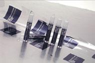
Multi-Color Foil is a decorating technology that transfers graphics and text to a container through hot stamping. An image is printed on heat-transfer Mylar film using specialized screen or gravure printing presses. It can include spot colors, metallic colors and also four-color process work. The film is then transferred in one pass to plastic, aluminum or glass containers.
“It doesn’t have the look of a press-on label. There’s no real texture to it at all. And the seam line, where the overlap is, is often totally invisible,” said Mark Valle, head of marketing for North Pacific Consulting, a manufacturer of hot stamping foils in Ontario, CA.
There are other ways to achieve visual impact through color. Screen printing or spraying with organic inks can broaden a designer’s color palette. While organic inks are not as durable as ceramic inks, they allow designers to use shades that are difficult to obtain, such as red and yellow.
Spraying technologies continue as a popular method for creating background color. “If we spray a bottle, we can totally change the look of it, whether we spray it translucent, opaque or frosted,” said Bob DeProspo, executive vice president, sales and marketing for USS Corp., Newark, NJ.
The use of spray frosting, in particular, is increasing. “Spray frosting has increased in popularity for both glass and plastic containers, especially for light to dark shades. Many customers prefer to color match the spray frosting to specific PMS colors,” said Steven Nussbaum, director of marketing for O.BERK Company/Cosmetic Packaging Group, Union, NJ.
Spray finishes can be used creatively. DeProspo said that a technique to watch is masking: specifically, frosted glass bottles with a clear spot in the front and a printed image that appears through it from the back of the bottle. Also noteworthy are bottles with graduated spray, and those with several different spray colors.
If attention-grabbing color effects are not the aim of a brand marketer, color can also make simple statements. Those leaning toward elegant simplicity can custom match the color of text to a colored cap. This can be achieved through silk screening or labels.
“We do a lot of color matching. So I might have someone who uses a stock bottle, and then they use a custom colored cap, and then they build a clear label using a matched color to their cap,” said Paulette Carnes, president of Ampersand Label located in Garden Grove, CA.
 |
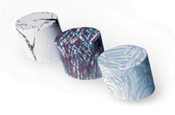
| The illusion of texture can be created through Fluid Imaging Technology, as seen in this picture from Lombardi Design & Manufacturing. |
Creating Texture, Real or Imagined
To appeal to more than the sense of sight, many marketers are looking for ways to incorporate texture, or the look of texture, into package decoration.
In labels, Van Alstine said texture is typically achieved with screen printing, but “coatings can be a really innovative way to give the label not only texture but protection. Through a combination of both rotary screen and coatings, there are some interesting things you can do.”
Raised texture can make a package easier to grip, and it can also accentuate certain text or graphics.
Texture can be created using other technologies as well. “The feel of the package can be changed by using a soft touch bottle,” said Jean-Marc Perez, president of Mepco in East Orange, NJ. Soft touch can be achieved through a soft touch spray or through the use of a soft touch additive in the resin, if the stock package is made to order and plastic.
Soft touch labels are also possible. “More and more companies, in 2005, are wanting very soft labels,” said Carnes. “We have been asked more and more for a textile feeling in the coating. I’ve heard it described as a ‘dusty feel’.”
Sometimes a package needn’t have a texture, but it must give the illusion of one. Label printer Logotech, Fairfield, NJ, is working on a project using graphics that give the impression of texture.
“We are seeing labels that look tactile. For example, labels that look like parchment paper, but the feeling of texture is actually built into the print design,” said Leslie Gurland, vice president of the company.
The illusion of texture can also be accomplished through Fluid Imaging Technology, a process licensed by Tarjac, a custom decorative paint job shop in Waterloo, NY. This three-dimensional printing process transfers patterns to hard objects, such as caps.
“We do a lot of three-dimensional patterns for the hunting industry,” said Brett Jump, sales manager. “We’re trying to expand what we do out of the hunting industry. The cosmetic industry has huge potential.”
The seven-step process culminates in a dipping tank, where the product is immersed, and an image is transferred from a floating, specially treated film to the product. A finished product can look like marble or wood, for instance. This technology is excellent for patterns, but is not recommended for fonts or logos.
There are other ways to create the feeling of depth. Seen at Luxe Pack ’04 at the Saint-Gobain Desjonqueres booth were custom glass bottles with color finish sprayed inside. This has potential to cross over into stock package decoration.
While it’s a new way to use a familiar technology, it does come with its challenges. “Inside glass coloring is not seen frequently, although it could become popular. The difficulty is that the bulk is in direct contact with the color, and that could possibly cause problems with respect to the necessary separation of the two. From a design point of view, spraying color inside a glass bottle is interesting as you can reach more depth, similar to a 3D effect,” said Dieter Bakic, founder of DieterBakicEnterprises in Munich, Germany.
|
Skyn Iceland Offers Serenity in the City
|
 |
| Skyn Iceland |
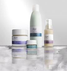
With its skin care launch at Henri Bendel in New York City this month, young company Skyn Iceland hopes to transport its customers from the hustle and bustle of city life to the serenity of Iceland. The Skyn Iceland line, featuring seven products and a kit of travel-sized items, says stress relief through its packaging.
“Our goal was to have packaging with lines that are clean, modern and fresh. Obviously we wanted to reflect our concept about reducing stress, so the packaging had to be really stress-relieving,” said Sarah Kugelman, founder and CEO.
Skyn Iceland used all stock packaging for its line, working with vendors such as Rexam and ABA Packaging. According to Kugelman, the way these packages felt in a consumer’s hand was especially important. Two of the products feature plastic with soft touch additive in the resin and several of the glass products have been frosted for an appealing look and feel.
The visual presentation was equally vital. The decoration is simple, clean and fresh. “Everything is frosted and clear, natural. The caps of the jars are white, but other than that everything is natural,” said Kugelman.
Glossy white and metallic pearlized labels complete the primary package. This color scheme is carried to the secondary packaging, which features a glossy white exterior with a pearlized metallic color band around the center.
While stress affects everyone, the target audience of this new brand is women aged 25 to 40. The line is enriched with Biospheric Complex, a proprietary blend of oxygen, Icelandic glacial waters and arctic botanicals aimed at combated stress-related skin problems.
“The whole positioning is about stress, and how stress affects your skin: what happens during stress, what your body depletes during stress, and also that your skin gets irritated and has problems under stress,” said Sharon Garment, a cosmetic industry consultant based in New York City, who worked with Kugelman on the project.
Because many of the ingredients were sourced in Iceland, its importance was reflected in the packaging. The decorations were meant to “conjure up images of Iceland,” said Kugelman. Stock packaging helped propel this image.
“In terms of creating consistency, and creating something very clean and simple and fresh, it’s pretty easy to do that with stock packaging. The options are broader than they used to be. It is possible to find something that is modern and clean looking, and then the decoration really brings the personality,” said Kugelman. |
|
Adding a Metallic Touch
In some circumstances the cost is prohibitive, but metallic effects are a beautiful way to customize stock products.
 |
| O.BERK Company’s stock line of Oval PETG Jars can be enhanced through a variety of decorating methods. |
Lombardi Design & Manufacturing, located in Freeport, NY, has been doing a lot of work with electroplating recently, noted Victor Caracappa, sales manager.
“Electroplating is a process where you take a plastic component and you make it either chrome plated or gold plated. What you’re doing is taking a component and putting it through a series of baths,” he said.
Electroplating offers an effect similar to vacuum metallizing, in which a component goes through a vacuum container, and is eventually sprayed with lacquer. The quality of electroplating is better, said Caracappa, because there is no danger of “orange peeling,” the little ripples that sometimes occur on a vacuum metallized product.
Electroplating can be expensive, however, especially when using gold. “They actually use gold. Usually when electroplaters quote you for gold plating, they base it on the price of gold at the time they are doing the job,” noted Caracappa.
Hot stamping is a particularly popular decorating method for adding metallic effects, and is less expensive than electroplating. Hot stamping, a process where foil is transferred onto a substrate, can be used on plastic and on labels.
There is a way to achieve a similar look on glass. According to O.BERK’s E-Z Packaging Reference Guide, raised gold/palladium decorating is “used to create a raised, precious-metal effect on glass and ceramic ware. A clear ceramic flux is applied and fired in a lehr. The gold or palladium is then screened exactly over the flux and then fired in a lehr.”
The cost limits its use, however. “I see less of it because of the expense,” said DeProspo. “People use it on high end products. It’s not for a mass brand.”
If an expensive decorating technology is not feasible, there are many other ways to achieve prestige metallic looks on smaller budgets.
On the labeling front, metallic effects can be created less expensively than hot stamping through the use of other technologies. Cold foil application is an up-and-coming technology, in which foil is transferred using adhesive and a printing plate instead of hot stamping dies.
“It is much less expensive than hot foil stamping although still not quite as consistent. It continues to get better and better, however, and deserves to be looked at,” said Van Alstine.
Metallic inks can also be used to great affect, and reverse printing metallized film is another option for a metallic look on labels.
In keeping with the trend toward design simplicity, some look for ways to minimize the visual power of metallics. “You’ll see a very refined look, almost what I would call tuxedo lapel, which is a matte lamination or matte varnish on certain products,” said Elisha Tropper, president of Prestige Label Company, New York City. “You even see that with foils, where you take the brightness of foils and you lay a matte lamination over it to give it a more subdued look.”
 |
| Multi-Color Foil is transferred using hot stamping as seen in the decoration of these beauty packages, above and below. Pictures are courtesy of North Pacific Consulting. |
 |
Variables Affecting Design
With the array of decorating technologies available, design possibilities seem endless. But some decorative designs are easier—and less expensive—to achieve than others.
This is especially true with label design. Knowing a printer’s capabilities can save both money and time. “You want to know who your printer is and what his or her capabilities are in terms of colors. From a material standpoint, you should know what you’re designing for. It makes a very big difference if you are designing a white label, a clear label or a foil label. You want to know what the print tolerances are in terms of borders, in terms of how fine the font is,” said Tropper.
“Also be aware of dies,” he continued. “You want to find out which die sizes your printer has if you don’t want to buy new dies. You want to take advantage of that.”
Other variables relate to machinery—flexography will cause more dot gain than offset printing and should be accounted for in the design. And in terms of cost: the more printing plates needed, the greater the expense. Consequently, printers recommend that customers consult them at the beginning of the design process.
“Designers should engage the printer at the point of design, so that they aren’t designing something that can’t be printed. Different printers have different capabilities and can do different things,” said Van Alstine.
The same is true with other forms of decorating. Package decorating experts can help point out potential challenges in other areas before they become a problem.
“What we say to them is come out here, sit with our engineers, play on the CAD (Computer Assisted Design) systems with it, so that we can take your ideas and design and actually show you what it will have to be so that you can make any modifications to it before it goes to management,” said Caracappa.
Customizing Stock
A smartly decorated stock package can yield excellent results. No matter what decorating technology is employed, the goal is customizing the package in such a way that it enhances brand image.
“What you are trying to do is not compromise on your brand equity, not compromise on your graphic presentation, not compromise on the image of your product. That’s really the challenge. You may use stock components all over the place, but you want the customer perception to be anything but stock,” said Tropper.
|


