Marie Redding, associate editor01.31.16
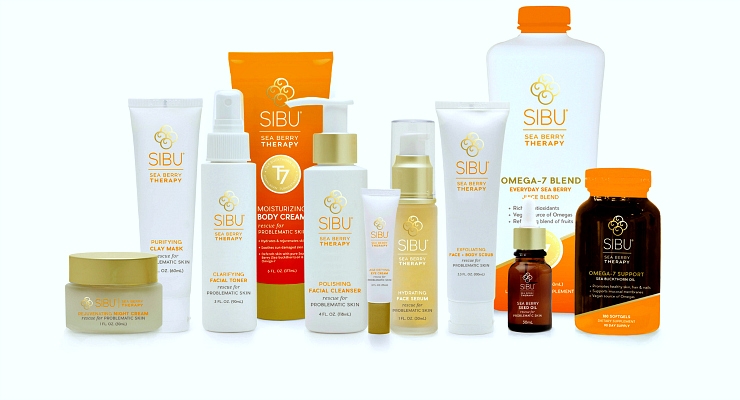
Natural skin care and supplement company SIBU Sea Berry Therapy, has a new logo, newly designed packaging - and even a new name. The Salt Lake City, Utah-based company recently began rolling out the new packaging to retailers.
The company’s skin care line first made its debut as Sibu Beauty in 2009. Sibu had been making supplements since2004, and extended its ingestible products with a new brand extension in 2013, Sibu 7.
Now, a rebranding combines both Sibu Beauty and Sibu 7 lines under the company’s new name, SIBU Sea Berry Therapy. The name change highlights the star ingredient, which delivers beauty benefits in both topical and ingestible products.
“The rebranding and name change brings the separate identities of both lines together
as one big happy family, so to speak,” explains Wendi Coombs, brand ambassador.
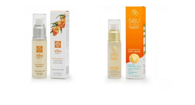
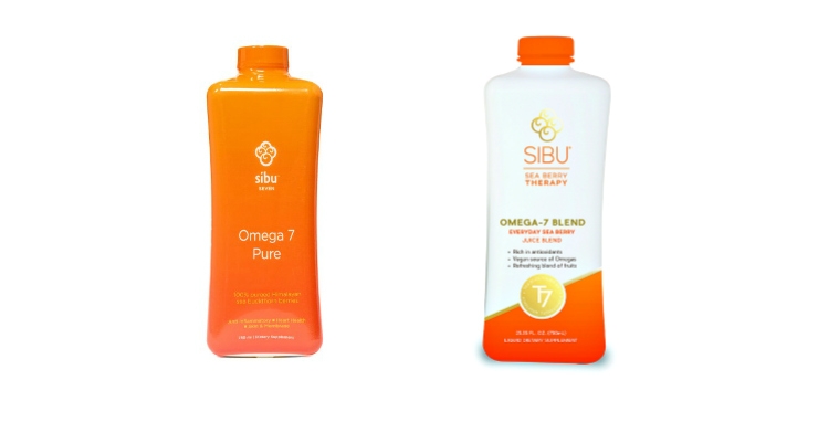
Along with the new name, the company redesigned its packaging. Dusty McMullin, vice president of operations, explains, “The right packaging is like curb appeal for a house - it can capture attention and give shoppers an initial impression. Without it, you might miss the opportunity to show a buyer what’s inside.”
McMullin explains that his team worked hard to deliver “impressive curb appeal without breaking the bank,” when developing the brand’s new packaging.
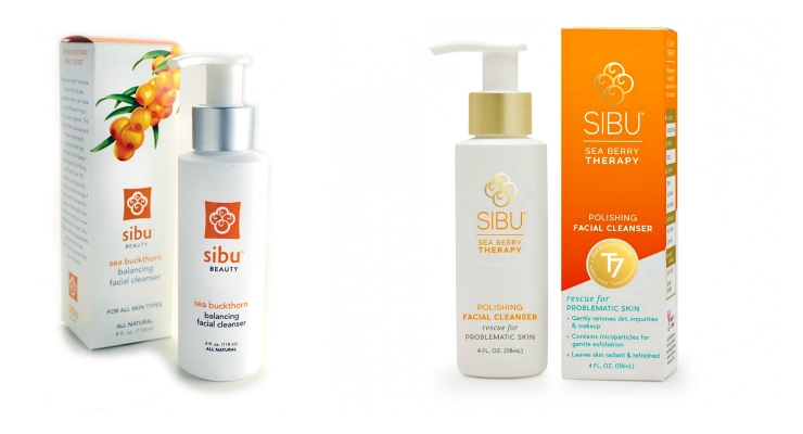
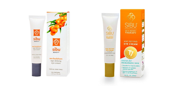
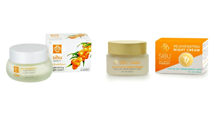
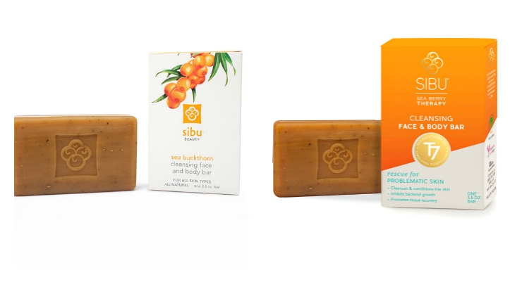
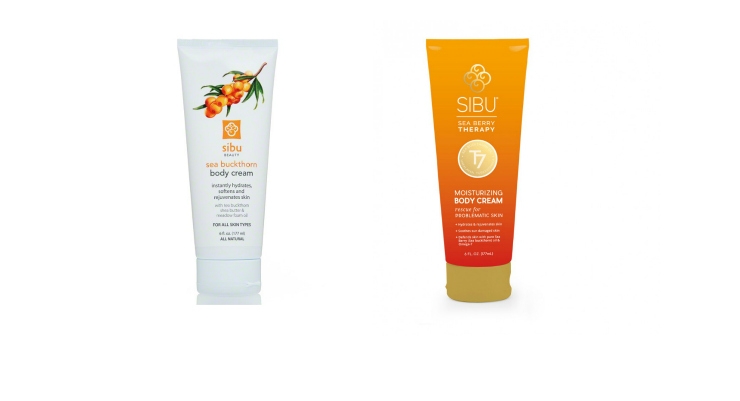
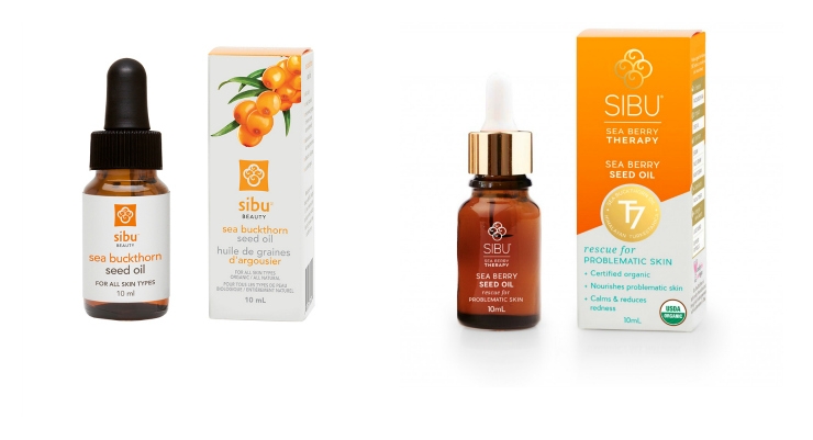
Click through the slideshow above to see the “before” and “after” photos.
Highlighting A Star Ingredient
SIBU Sea Berry Therapy products contain Turkestanica Sea Berry, which the company calls “an Omega-7 powerhouse.” The brand highlights this ingredient as a design element on the new packaging - a “T7” seal printed in matte gold.
The official name for the ingredient, "Sea Berry," is sea buckthorn, but it is also known as seaberry. These are the common names for the plant species Hippophae, which produces small orange-red berries. To be more precise, the source of SIBU’s sea buckthorn is a shrub, Hippophaerhamnoide subspecies turkestanica .
This plant is widely cultivated throughout Central and South Asia. “It thrives in the extreme alpine environment of the Himalayan Highlands,” says Coombs. Its seed and pulp oils are the parts of the plant typically sourced for use in cosmetic products and nutritional supplements. The oil extracted from sea buckthorn fruit pulp and seeds promote healthy skin and act as raw material for the pharmaceutical and cosmetic industries, according to Re.Herb.
“Eight out of ten customer testimonials we receive are in some way related to problematic skin, and how our products have made a difference,” Coombs says. “Our Sea Berry contains more than 190 bioactive compounds, including Omega-7, to support healthy skin, hair and nails when used in topically and internally,” she explains.
For all these reasons, the decision to highlight the ingredient name on the packaging and in the name itself made sense for the brand. “The new name highlights our key difference from other natural skin care lines, which is the fact that we take care of the skin from both the outside and the inside,” Coombs says.
A New Logo & Tagline To Convey Product Attributes
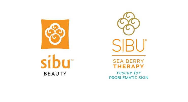
SIBU Sea Berry Therapy’s new logo depicts a cluster of berries in matte gold instead of orange and white, which were the colors of the previous logo. “We updated the logo, and gave it a modern twist,” says Coombs.
The company worked with Pulp & Wire, a design agency based in Maine, on its new packaging.
The new sub-tagline for the brand’s skincare products is "Rescue for Problematic Skin.” “The tagline conveys that our products help alleviate a multitude of skin problems, including excessive dryness, signs of aging, sun damage, and the symptoms associated with acne, rosacea, and eczema,” Coombs explains.
The cartons have a clean, modern look - minus the illustration of berries on a branch used on its old boxes. A new side panel design suggests additional products for the user, listedunder: Cleanse, Repair, Hydrate, Luminate and its supplement category, Omega-7.
The Package Development Process
McMullin explains more about the company’s package development process, saying he considers building relationships with suppliers important. “We often consult with designers, and analyze what our competitors are using, when choosing a new package. We have partnered with several different packaging suppliers over the years that we have grown to trust,” he says.
McMullin’s team also tests every new component to ensure compatibility with each product. This testing also ensures that the package - and its dispensing system - delivers a quality experience for the user.
During the redesign process, the brand kept many of the same bottles, jars, caps, and tubes. “A few of the packages are entirely new, and we used screen printing to give the line a ‘facelift,” says McMullin. He continues, “Our new design includes several gold foil elements, and one of the most challenging issues we had was was working with five different suppliers to make sure the foil was the same color on many different materials, surfaces and finishes.”
McMullin reflects on the color matching process, adding, “We were able to achieve an exact match, but it required lots of patience, communication, and what we never have quite enough of—time.”
Take a look at SIBU Sea Berry Therapy’s new look in the slideshow above.
The company’s skin care line first made its debut as Sibu Beauty in 2009. Sibu had been making supplements since
Now, a rebranding combines both Sibu Beauty and Sibu 7 lines under the company’s new name, SIBU Sea Berry Therapy. The name change highlights the star ingredient, which delivers beauty benefits in both topical and ingestible products.
“The rebranding and name change brings the separate identities of both lines together
as one big happy family, so to speak,” explains Wendi Coombs, brand ambassador.
Along with the new name, the company redesigned its packaging. Dusty McMullin, vice president of operations, explains, “The right packaging is like curb appeal for a house - it can capture attention and give shoppers an initial impression. Without it, you might miss the opportunity to show a buyer what’s inside.”
McMullin explains that his team worked hard to deliver “impressive curb appeal without breaking the bank,” when developing the brand’s new packaging.
Click through the slideshow above to see the “before” and “after” photos.
Highlighting A Star Ingredient
SIBU Sea Berry Therapy products contain Turkestanica Sea Berry, which the company calls “an Omega-7 powerhouse.” The brand highlights this ingredient as a design element on the new packaging - a “T7” seal printed in matte gold.
The official name for the ingredient, "Sea Berry," is sea buckthorn, but it is also known as seaberry. These are the common names for the plant species Hippophae, which produces small orange-red berries. To be more precise, the source of SIBU’s sea buckthorn is a shrub, Hippophae
This plant is widely cultivated throughout Central and South Asia. “It thrives in the extreme alpine environment of the Himalayan Highlands,” says Coombs. Its seed and pulp oils are the parts of the plant typically sourced for use in cosmetic products and nutritional supplements. The oil extracted from sea buckthorn fruit pulp and seeds promote healthy skin and act as raw material for the pharmaceutical and cosmetic industries, according to Re.Herb.
“Eight out of ten customer testimonials we receive are in some way related to problematic skin, and how our products have made a difference,” Coombs says. “Our Sea Berry contains more than 190 bioactive compounds, including Omega-7, to support healthy skin, hair and nails when used in topically and internally,” she explains.
For all these reasons, the decision to highlight the ingredient name on the packaging and in the name itself made sense for the brand. “The new name highlights our key difference from other natural skin care lines, which is the fact that we take care of the skin from both the outside and the inside,” Coombs says.
A New Logo & Tagline To Convey Product Attributes
SIBU Sea Berry Therapy’s new logo depicts a cluster of berries in matte gold instead of orange and white, which were the colors of the previous logo. “We updated the logo, and gave it a modern twist,” says Coombs.
The company worked with Pulp & Wire, a design agency based in Maine, on its new packaging.
The new sub-tagline for the brand’s skincare products is "Rescue for Problematic Skin.” “The tagline conveys that our products help alleviate a multitude of skin problems, including excessive dryness, signs of aging, sun damage, and the symptoms associated with acne, rosacea, and eczema,” Coombs explains.
The cartons have a clean, modern look - minus the illustration of berries on a branch used on its old boxes. A new side panel design suggests additional products for the user, listed
The Package Development Process
McMullin explains more about the company’s package development process, saying he considers building relationships with suppliers important. “We often consult with designers, and analyze what our competitors are using, when choosing a new package. We have partnered with several different packaging suppliers over the years that we have grown to trust,” he says.
McMullin’s team also tests every new component to ensure compatibility with each product. This testing also ensures that the package - and its dispensing system - delivers a quality experience for the user.
During the redesign process, the brand kept many of the same bottles, jars, caps, and tubes. “A few of the packages are entirely new, and we used screen printing to give the line a ‘facelift,” says McMullin. He continues, “Our new design includes several gold foil elements, and one of the most challenging issues we had was was working with five different suppliers to make sure the foil was the same color on many different materials, surfaces and finishes.”
McMullin reflects on the color matching process, adding, “We were able to achieve an exact match, but it required lots of patience, communication, and what we never have quite enough of—time.”
Take a look at SIBU Sea Berry Therapy’s new look in the slideshow above.

