Sheri Koetting, co-founder, MSLK09.28.17
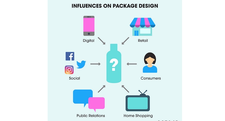
Excellent formulations are critical to retaining customers, but in beauty, packaging makes the first introduction. The most important tool an indie brand has is its packaging. One hundred percent of your customers will interact with your packaging; no other form of marketing will receive comparable levels of engagement.
Illustrations above: © MSLK
Packaging Considerations for Customers
Loyal customers often fuel an indie brand’s breakout success. Defining your unique point-of-view and brand value proposition can draw faithful followers. The secret lies in understanding how you answer your consumers’ pain points, their unmet hopes, and their desires.
Designing packages to connect with customers begins with these considerations. Some attributes can be communicated with design, while words must handle other levels of information. Your designer’s job is to ensure that the packaging profiles, materials, color, symbols, and words you use reflect such positioning.
Packaging Considerations for Retail
Over 90% of sales still occur in brick-and-mortar retail stores. This means the foot-traffic and exposure to new audiences an indie brand receives at retail is incredibly valuable. But at retail, you have very little control over how your brand is presented. It is critical that you create a package that will stand out among the noise and competition at retail.
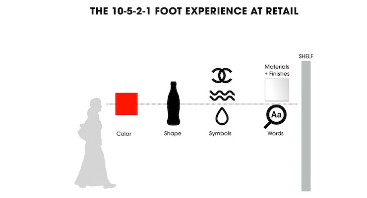
Consider your customer’s ten-, five-, and two-foot experience with your product as they walk down the aisle: use color and overall packaging structure to draw customers in from afar. By five feet away, clients can begin deciphering the symbols, iconography, and key imagery of product lines. At two feet, customers consider the materials, finishes, and words on your packaging.
See the illustration of this in the second slide above, © MSLK
Packaging on Your Brand Site
In contrast to retail, the consumer is in control on digital media. Here, words are the first tools you have to connect with customers. Words power key-word searches, website menu navigations, hashtags, and user forums. Make sure your brand and product names are descriptive, distinct, and inviting, so when your customer finds you, she is enticed to learn more.
Descriptive names, like “DryBar,” names that highlight a key ingredient, like “Shea Moisture,” or names that convey founder authority, like “Dr. Brandt,” tend to generate awareness with more ease and less expense.
Packaging Delivered to Your Door
A well-designed shipping container and unboxing experience is a significant, post-purchase factor. By giving your consumers something that reflects their taste and lifestyle, they will brag about you online. User-generated content is trusted seven times more than traditional advertising, making it incredibly valuable.
Packaging for Dotcom E-Tailers, Social, and Video
The colors and shapes that distinguish your brand at retail can also help your package pop when reduced in size online. Whether it is a little image on a product-landing page, an Instagram post photographed by fans, or a YouTube video, it is imperative that your product be both easy to shoot and identify. Shiny or metallic packaging will glare on camera; stripes and intricate patterns tend to vibrate on video. Instead, select bold and colorful packaging options with clear, simple, popping typography. For example, jewel tones tend to be more favorable than black, white, red, or yellow.
Remember, packaging is essential to success, especially for indie brands seeking exposure. Make sure your packaging defines your brand.


