12.28.17
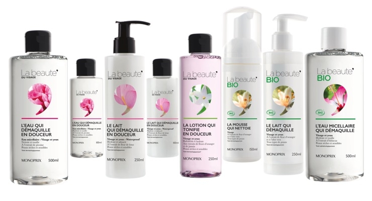
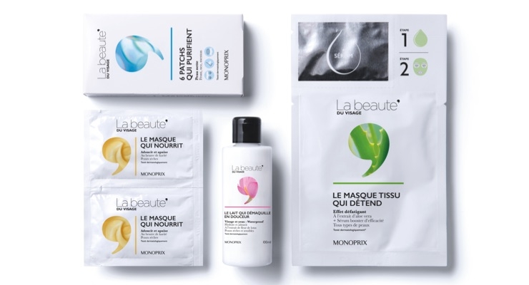
Monoprix’s new “La Beauté du Visage” skin care line features all the essentials women need for their daily face care regimen, from cleansers to moisturizers and masks.
The line is resolutely urban, practical and affordable to “estheticize the everyday” of urbanites. For Monoprix’s new line, Brandimage sought to create a sleek and elegant graphic identity with a didactic and positive marketing tone.
A Strong Visual Identity
For this new skin care line, Brandimage put a subtle spin on the Monoprix graphic identity, using the apostrophe for which the retailer is known in a new way. Designed as a window onto the main ingredient or texture of each product, the symbol reveals the natural and technical benefits of the products and evokes the effectiveness and pleasure of using them. Ensuring transparency regarding the containers was a natural graphic design choice with a chic and modern appeal.
Simple Says It Best
While the packaging is the first element that catches the customer’s eye in stores, the right on-pack tone is key to creating a connection. Brandimage chose an optimistic, engaged and didactic tone focused on the product benefit for “La Beauté du Visage” line, with names such as
“The toner that cleanses” or “The cream that nourishes”. The aim was to make the offer easier to understand and communicate Monoprix’s desire to give women real products that say what they do and do what they say.
Bringing Efficiency and Elegance
“We have focused the work on how to magnify the retailer’s icon and the product ingredient simultaneously, bringing efficiency and elegance with an urban modern touch,” said Elie Hasbani, creative director Brandimage
Regarding the packaging, Hasbani said: “We did research to select specific stock packaging creating a harmonious family of products, elegant but simple and practical, very transparent or glacier white. The bottles have transparent labels, other products have décor printed directly on the plastic packaging.”

