Andrew Capper01.25.18
Our lives are increasingly full on, cluttered and constant. We desire a sense of stripped back clarity and calm. Similarly, we are becoming much more conscious of this need for mental solace and quietness in our switched-on worlds.
As our desire for all things simple continues to grow, we’re noticing more elegant and refined executions of this within the beauty packaging landscape.
Today’s world of simplicity is an evolution of minimalism and presents more controlled and refined detailing alongside clean, minimal materials and forms. Considered, controlled geometry, engineered detailing, refined material use and dimensionality in digital design are all championed.
There is a bold sense of confidence that is inherent in true simplicity. These are visual worlds and products that have nothing to hide behind. Quality is key. Only the crafted and truly considered succeed in the world of pure simplicity.
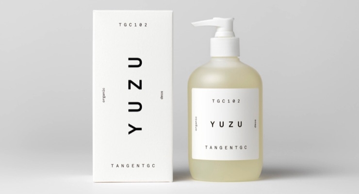
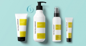
Fashion brands like Cos and Arket have brought minimalism to the many and now similarly, beauty packaging is pairing back, laying everything bare. As a result, color, finishes, textures and slight details speak volumes. We see this perfectly through Tangent GC’s Yuzu soap packaging and bottle design which embraces a frosted finish to exude quality through simplicity.
Today’s simplicity is about celebrating intricate details and flourishes. Strong color is celebrated, as are lines, shape, shadow, angles; every detail has an important role to play.
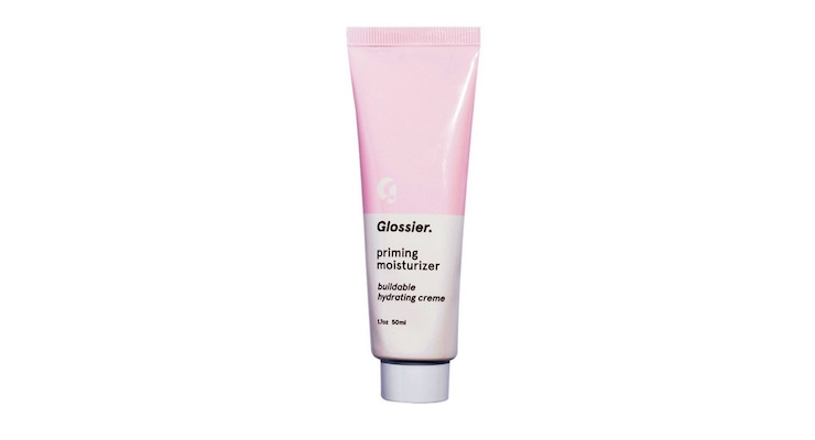
As a result, products, brands, interiors and fashion brands can be clearly identified through the smallest of bespoke craft in their detail. This detail speaks volumes in a paired down world showcasing a real sense of bold confidence. This is demonstrated by Glossier’s priming moisturizer which embraces a white minimal tube pack that confidently “heroes” the product within.
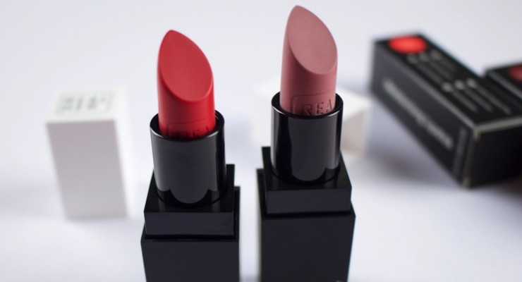
Simplicity means that one or two key features are designed to really shine. Whether it is a pop of color, the texture of a material or the line of a curve, the subtlest of features and details are heroed. Lipstick brand Real Her uses embossing detail to stand out through its simple design. When the super simple packaging is opened we are shown an intricate, crafted embossing of the brand mark to celebrate the crafted details.
Simplicity exposes everything. This poses questions around purpose and use. What’s the role of this product in our cluttered lives? Does it make our lives better?
We see products embrace modularity, offering multiple uses and functions that mean people can invest in less or more to adapt to changing needs. The “right of purpose” is key, meaning the best products have a true reason for being.
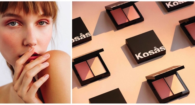
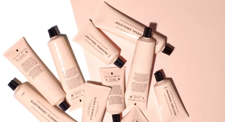
Across the beauty industry, a number of brands are emerging with streamlined regimes and limited, modular product ranges. We see this through Lixir’s product range that champions multiple use products and simple beauty regimes with a clean informative design. Similarly, Kosas Cosmetics describes its range as being “edited down to the essentials, keeping it easy to understand, intuitive to use, and endlessly enjoyable, every time.”
This new simplicity also presents new worlds in dimensionality. In digital design, interfaces transition from flat to semi-flat designs, adding depth and intrigue. A sense of exaggerated space is championed.
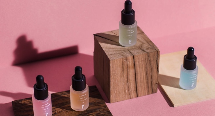
In beauty packaging, this manifests as subtle differences in color tone. Fading and shadowing finishes create appreciation of material texture, flatness vs depth. Prescription Lab’s serum pack is a great example of this, standing out through contrasting its frosted finishes with a tinted product within which then contrasts with the glossy black bottle cap.
How to embrace this new simplicity in your brand/packaging?
Be bold and confident, strip back embellishments and excessive detailing. Allow simplicity to expose and hero the product within through tactile material finishes and translucency.
Give the utmost attention to the smallest of details as this crafting will speak volumes in this stripped back world.

