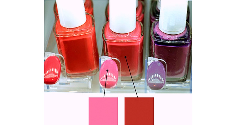
When it comes to cosmetic color or shade selection in the drug store aisle, or any mass market retail environment, the burden of decision-making falls directly on the shoulders of the consumer.
For cosmetics companies, this creates a great deal of risk – what if the consumer begins to second guess whether they have the correct match?
This problem is further compounded by the fact that despite all the shelving, backlighting and pricey fixtures… when the consumer is standing in the grocery aisle thinking she may need a new concealer, it all looks the same.
Color can be used strategically to distinguish a brand from the rest of the pack if executed in a thoughtful way to maximize consumer confidence in shade selection. More importantly, this is accomplished without the expense of makeup artists guiding the consumer, as is customary in high-end retail environments.
'Printing' Color Poses Challenges
There was a time when shade matching was done at the shelf with testers. They were messy, expensive and unsanitary, so brand marketers turned to printing images of the foundation color on the edge of the shelf and other displays.
Beyond printed images on the edge of the shelf (referred to as the bullnose), the product packaging often has a representation of the color, as does the imagery on the signage. Marketers provide multiple touchpoints with color shades to help shoppers; these approaches largely have not changed over the past 20 years.
In all their effort to “help” the consumer find the right shade, marketers have actually provided too many points of assistance, filling the consumer’s view with different representations of a single shade, and those colors do not match across touchpoints.
This becomes even more problematic when different materials on which the product color is represented (packaging: plastic tube of foundation; uncoated paper: shelf bullnose strip, coated glossy paper: advertisement on the wall) aren’t consistent. Instead of helping the consumer, brand marketers have confused them.
Why Doesn't the Color Match?
Why doesn't the color match?
- Producing flesh tones is challenging for most commercial printers and packaging converters. Some of the most difficult colors to print are grays, pastels and neutrals, including skin tones because they can be tricky to keep in balance throughout the print run. It is further challenging for printers to match the same tones in subsequent press runs without introducing color drift.
- Humans perceive more of the subtler differences in flesh tones than they do for other hues. Because we are more interested in faces, (the AOA states that newborns' primary focus is on objects eight to 10 inches from their face or the distance to parent's face) we pay attention to color more. This means that we are less forgiving of color discrepancies when it comes to flesh tones. Therefore, color tolerances that are provided with production specifications for printers need to reflect a tighter Delta E. (Delta E is the industry standard measurement of the variance from the standard of the color that was produced.)
- With major brands making commitments to use“unretouched photography,” the brand’s process for producing imagery is changing. Brands such as Aerie and retailers like CVS avoid Photoshopping ads due to overwhelming feedback and requests to see more natural models from female consumers. Established production grooves are being challenged to respond to these new programs and initiatives.
- The technical challenge of matching colors across multiple materials from product, packaging, shelf strip to advertising, remains difficult. Many times, each representation of the color is different. Which one should the shopper use to match with their skin? Who owns the color standard?
Almay's Packaging Doubles As A Shade-Finding Tool
So how can brands overcome these color challenges? Here is an example of how one brand is trying to solve the problem.
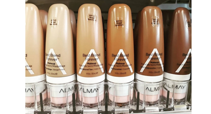
Almay (see second photo in the sider above) doesn’t use any color stripe on the bullnose of the shelf, like many companies do. They also don’t use images of the products on their in-wall advertising. They reduce the reference points for color to only the product packaging itself.
By using the packaging as the only available shade finding device, the shopper is forced to pick up the product to hold it against her skin to match.
This is important to note because, once a shopper has touched a product, she is much less likely to put it back and she may even be willing to pay more if she gets to touch the product.
It’s also that much more imperative that the color of the product match the color on the product packaging – as the customer relies heavily on matching through product packaging alone.
Strive for Color Accuracy and Consistency
The current state of cosmetics aisles at mass retailers creates confusion for the shopper when deciding on a shade because of the color discrepancies between display images, bullnose shades, packaging color and the product.
Brand leaders who can create accuracy and consistency on marketing displays as well the product packaging and the product itself will improve the customer’s confidence to find the right shade, quickly.


