Jillian Wright, Co-Founder of Indie Beauty Expo01.17.19
As people continue to develop a deeper relationship with their personal care routines and products, brands are aiming to create experiences starting with elevating the look and feel of their packaging. Packaging continues to play an enormous part in what people are drawn to and eventually purchase. Indie brands are rarely just slapping labels on products without surveying the market and taking their brand mission into consideration-- weaving their stories thematically into the outer casings.
When thinking about brands who are exhibiting at IBE LA, happening on January 23-24 at the California Market Center, we are seeing less go for a monochromatic palette with many moving towards a kaleidoscope-like visual experience. They are consciously choosing design and color palettes that tell a deeper story. Though simple black and white is still trending, brands are paying closer attention to how the packaging can tell their story.
Here is a preview of 5 stand out brands that have taken their packaging to the next level. They are shown in the slider above.
Céla Skincare
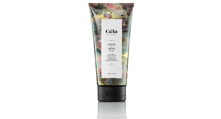
Founder and veteran spa owner Celine Tadrissi was inspired by Canada’s vast and rugged landscape when designing the packaging for her skin and hair care brand Céla. The marbled, colorful designs pays homage to the diversity of the elements, like water, snow and rock, found in nature and the botanicals used in the formulas.
Shaffali Skincare
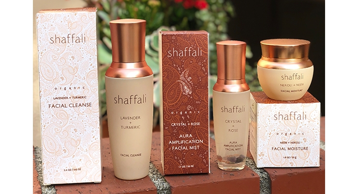
Shaffali Skincare is debuting new packaging at IBE LA. Now made of recyclable glass bottles and jars that maintain product freshness better while being more sustainable for the environment, the decision to revamp the line’s look was made to have packaging more in line with the company values of sustainability as well as aesthetically representative of the beauty and philosophy of their proprietary formulas with foundational ingredients of fruits, flowers, herbs and spices. Even the feel of the packaging is meant to mimic smooth river stones, intentional for connecting a person to nature and relaxation. This is the definition of “soup-to-nuts” packaging.
Aether
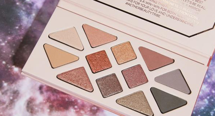
Aether’s packaging is zero-waste, using no magnets or mirrors and even resembles the crystals used in the cosmetics. Plastic makeup componentry is a huge source of pollution globally and founder Tiila Abbitt wanted to create a brand that was ethically-sustainable, beyond just the formulation. Abbitt spent 7 years at Sephora in charge of product development and her obsession with sustainability lead her to become the lead R+D for sustainable materials, before creating her own line.
SelfKaire
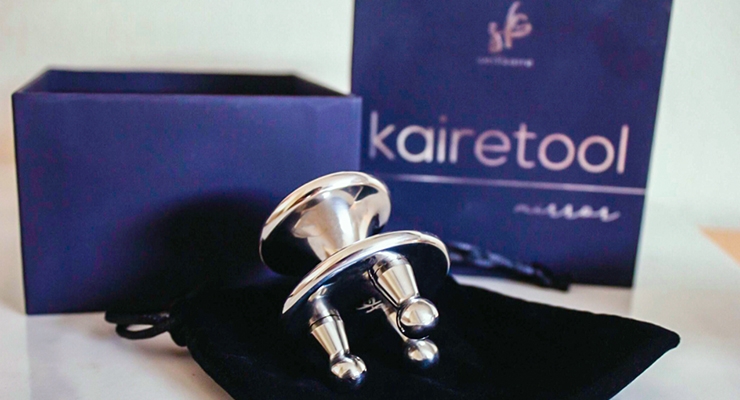
The design of SelfKaire’s packaging is meant to invoke a deep sense of calmness before you embark on your self-care ritual. Co-founder Kathy Chou chose the color midnight blue for the box and inner-casing because she feels the most at peace looking at a starry night sky or watching the gentle waves rolling in the ocean at night. The silver foil wrapped along the outside of the box hints at the high value of the tool inside, reminding people that luxury can be incorporated into self-care rituals. The delicate silver wrap around the box symbolizes one of the brand’s missions: a holistic treatment of every facet of your health and well-being, from inside to out.
Rock and Ruddle
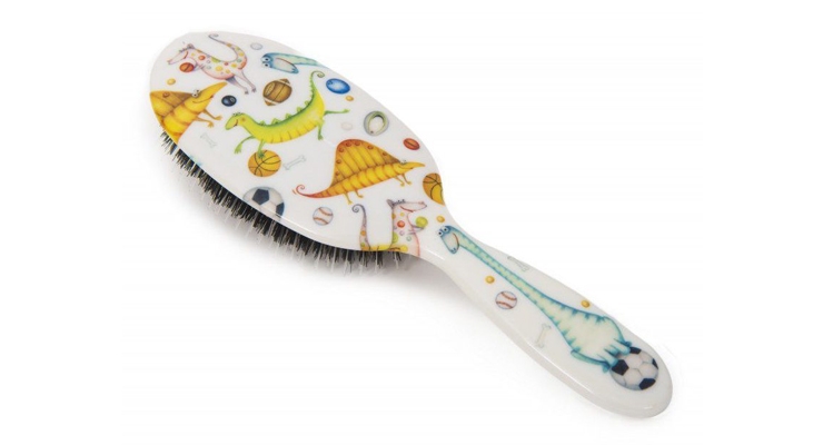
Rock and Ruddle from Great Britain has hair brushes for every mood, personality and character. From animal prints and quirky designs to metallics, Rock and Ruddle elevates coiffing to a whole new level by personalizing the experience. You can have one for every mood or member of your family or friends. The clear design was chosen to ensure that the consumer can see a 360 degree visual of the brush handle, natural bristles and nylon tips. The clear packaging also allows the consumer to see the detail and vibrancy of their brush designs. The hole in the back of the box lets the consumer see and feel the quality of the bristles before purchasing.

