Pamela Webber, COO of 99designs10.03.19
For brands in the beauty sector, the packaging stakes are high. Thousands of products vie for consumer attention everywhere from social media to the shelves in retail stores.
Not only do cosmetics brands need to create a look that appeals to their target demographic, it also has to be memorable and, in most cases, global, thanks to increasingly widespread online distribution channels.
Whether you’re just getting started with your first product launch or considering an update for an existing product, one critical place to start is with a review of current industry trends. Even if you ultimately decide to zig where others are zagging, it’s worth knowing what’s hot right now for some perspective.
Here are four current packaging design trends we are seeing all over the cosmetics industry today:
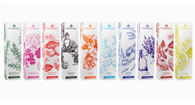
Intricate Line Drawings
Typically this trend is characterized by hand-made drawings, either cleverly placed in select areas or covering the whole product, as with these body oils shown above from Cerberus Beauty.
Example: See the photo above by bcra on 99designs.
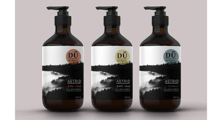
Black Packaging with a Twist
This is a timeless design trend, but what’s particularly prevalent right now is using black rather than white as the dominant hue, and utilizing subtle patterns or tiny pops of color to catch the eye.
Example: See the photo above by ha ku on 99designs.
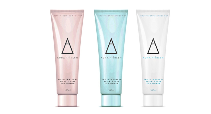
Modern Minimalist Pastels
Pastels can soften an otherwise austere or pared down minimalist packaging design.
This design from eiko.rie, shown above, shows how different pastel shades can be used to differentiate products within the same line to great effect.
Example: See the photo above by eiko.rie on 99designs.
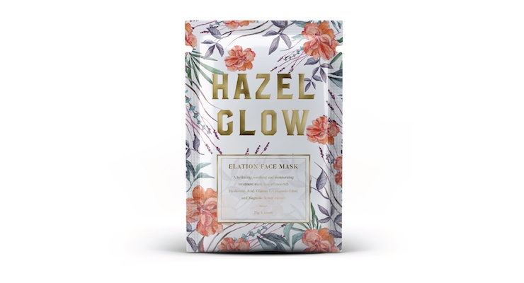
Lush Florals with Warm Earth Tones
We’re also seeing packaging covered in rich, warm floral illustrations and natural, earthy tones that create a comforting, slightly vintage look but with a modern edge.
This design for a facial mask from Hazel Glow, shown above, is a great example that combines this classic color palette with modern typography and negative space to create a fresh, but traditional, look.
Example: See the photo above by Ceros Design on 99designs.

