Marie Redding, Senior Editor12.10.21
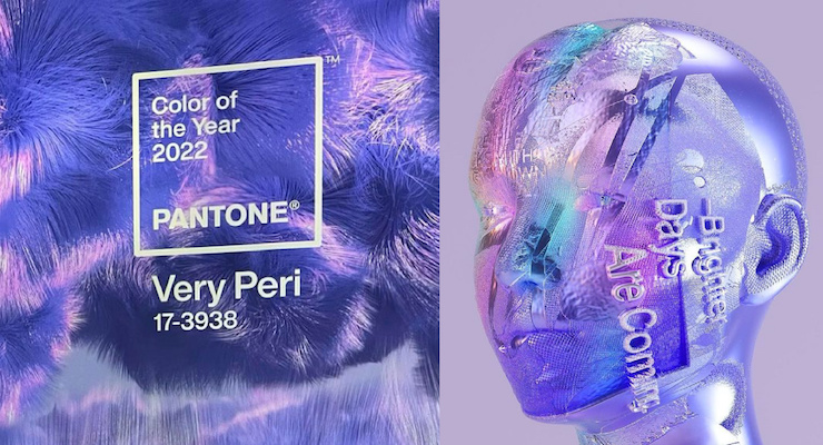
Pantone announced its 2022 Color of the Year, #17-3938 Very Peri—and it’s the first time in the 23-year history of its Color of the Year program that it didn't choose an existing color.
Very Peri is a brand new Pantone Color, created to reflect “the global innovation and transformation taking place,” says Laurie Pressman, vice president of the Pantone Color Institute.
The hue, which is slightly reminiscent of 2018's Color of the Year, Ultra Violet, Very Peri is meant to help us “embrace this altered landscape of possibilities, opening us up to a new vision as we rewrite our lives,” Pantone states.
See more about why Pantone created a new color—and its immersive digital launch event and in the news story—Pantone Creates a First-Ever New Color for the Color of the Year.
Very Peri is a Complex Hue
Very Peri is a mix of blues with a red-violet undertone. In developing the new color, the Pantone Color Institute’s team color chose blues, which convey stability and trust, and added a red-violet undertone to convey “a sense of freshness, and a movement toward the future," the company stated—"to reflect a digitalized world.”The combined hues create a new dynamic, creative, imaginative color—Very Peri. It's also meant to symbolize "moving ahead."
Leatrice Eiseman, executive director of the Pantone Color Institute, further expains in the statement:
“As we move into a world of unprecedented change, the selection of Pantone 17-3938 Very Peri brings a novel perspective and vision of the trusted and beloved blue color family.”
Eiseman also says that Very Peri "encompasses all the qualities of the blues—yet at the same time, its violet-red undertone displays a spritely, joyous attitude." She continues to explain that it has a "dynamic presence that encourages creativity.”
Very Peri blends "the faithfulness and constancy" of blue with the energy and excitement of red. Eiseman add that it is "the happiest and warmest of all the blue hues" and an "empowering mix of newness.”
Very Peri in Beauty
In Beauty, Very Peri is “suggestive of personal inventiveness and daring imagination,” Pantone states.It makes a bold statement for eyes, nails, and especially hair, when used in a various of finishes and applications. It can look glittery and glam, or dusty and matte.
Some beauty products and beauty packaging are already on-trend and look ‘very peri’—or close to it.
They include–
- Tatcha Luminous Dewey Skin Mist
- Gucci Rouges à Lèvres Mat Lipstick in Jenny Purple
- Guerlain Rouge G Stunning Gem Customizable Lipstick Case in Amethyst Emotion
- Clinique All About Shadow Quad Eyeshadow in Going Steady
- Anastasia Beverly Hills Norvina Pro Pigment Palette Vol. 5 in Lilac
- Byredo Color Stick in Purplestinge
- Fenty Beauty Mattemoiselle Plush Matte Lipstick
- Olive & June Bold & Unshaken Nail Polish
Very Peri in Design & Packaging
In graphics, design, and packaging, Very Peri “conveys a message of credibility as well as creativity,” Pantone states.“Whether appearing in a fantasy digital realm or in physical materials, Very Peri exudes a good-natured warmth that quickly engages the eye, making it an ideal shade for many applications of graphic and multi-media design, as well as packaging,” the company says.
Very Peri in Fashion
Celebrities have already worn colors that resemble Very Peri, Vogue reports.Lady Gaga wore a purple silk chiffon dress with a flowing cape from Gucci’s Spring 2022 ready-to-wear collection for the London premiere of the the film she stars in, “House of Gucci.” (But this dress reminds us more of 2018's Ultra Violet.)
Virgil Abloh’s final collection for Louis Vuitton men’s wear also includes versions of the hue, WWD reported.
How Pantone Chooses the Color of the Year
The Pantone Color Institute selects the Color of the Year—and forecasts the top fashion runway colors each season and global color trends. The Institute also advises beauty and packaging companies on color for product and brand visual identity.Before choosing the Color of the Year, the team analyzes trends, considering global color influences from all industries, including: entertainment and films in production; traveling art collections and new artists; fashion; and all areas of design.
They also consider popular travel destinations; lifestyles; and socio-economic conditions, as well as new technologies, materials, textures, and effects. Each of these influence color, and our feelings about it.
Once chosen, Pantone’s Color of the Year influences and inspires designers in all types of industries, including fashion, home furnishings, and industrial design.
It also influences product development and purchasing decisions, and packaging and graphic design.
Color Palettes—& How To Use Very Peri
The Pantone Color Institute created four unique color palettes to help designers use Very Peri. They are—- Balancing Act: A mix of warm and cool tones to compliment Very Peri—with Burnished Lilac, Muted Clay, Granite Green, Hawthorne Rose, and more.
- Wellspring: A holistic and harmonious blend of nature-infused shades surround Very Peri, including Foliage, Treetop, Eggshell Blue and more.
- The Star of the Show: An elegant palette surrounding Very Peri with classics and neutrals—Deep Taupe, Volcanic Glass, White Sand, Cloud Dancer and more.
- Amusements: A joyous, whimsical, fun color story to bring out Very Peri’s playfulness with Tawny Orange, Pink Flambe, Paradise Pink, Tourmaline and more.
Creating with Pantone Very Peri
Designers can create a free account to use Pantone Connect, a digital color platform.Pantone Connect includes the four pre-loaded color palettes listed above, plus every other Pantone color. The hues are available to share, save, and use in your design files.


