Jamie Matusow, Editor-in-Chief06.05.17
MuLondon, producers of artisan organic skin care products, which feature “simple and mild, yet effective cruelty-free and vegan formulas based on time-proven herbal ingredients,” has unveiled a fresh new brand identity. The London-based brand, which was launched in 2008, says the understated look has been carefully chosen to reflect the company’s values: clean, simple, modern and honest.
Boris Zatezic, founder & CEO at MuLondon, tells Beauty Packaging about the packaging he chose for conveying the brand’s new identity. “The bottles, jars and lids are all stock, however, they’re all from different suppliers, as we wanted a specific, uniform look that we could not get from just one company,” says Zatezic. “For example,” he explains, “the lids that our jar supplier offered did not appeal to us, so we sourced them from another company. We also did not want to use any PVC-containing materials, which made sourcing just the right lids even more difficult.”
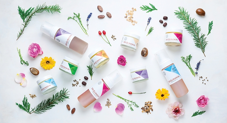
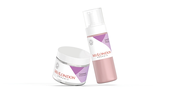
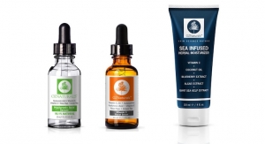
MuLondon moisturizers, such as “Marigold, Frankincense & Myrrh,” are now packed in luxurious, heavy-duty glass jars (SGD France), fitted with polypropylene caps with EPE liners (Mold-Rite Plastics, USA). Cleansers, like the lush and fragrant “Rose, Rosehip & Rosemary,” come in semi-transparent foamer bottles (Albéa, France), which are free from phthalates, bisphenol-A and PVC, and topped with frosted caps. As a finishing touch, the range is adorned with new matte-laminated labels.
Along with the new look, MuLondon is presenting its latest achievements in the form of three highly coveted seals of approval: The Soil Association Organic, (the UK’s leading organic certifier); 1% For The Planet (at least 1% of total sales are donated to environmental non-profits); and Certified B Corporation (MuLondon is the first UK skin care company to be certified, joining other corporations that use business as a force for good, with a triple bottom line: people, planet and profit).
MuLondon’s new brand identity was created by Marcos Dos Santos Lisboa, an award-winning international designer. The packaging incorporates large areas of white space and clean, simple lines with dashes of color. Each MuLondon formula has specific characteristics and unique fragrance and healing properties reflected in the colors, which have been carefully chosen for each of the products.
According to Dos Santos Lisboa, “Simplicity and purity were the main ingredients I used to reflect the new brand identity for MuLondon. The aim was to develop a new visual perception of MuLondon, based on its organic origin, respect for nature and expertise. During the creation process, Paul Cézanne’s explorations of geometric simplification and optical phenomena were my references. The result is a graphic abstraction inspired by nature: a flower field, an ingredient, a fragrance. Additionally, the careful choice of colors was instrumental in capturing the true essence and personality of each product. My desire was to summarize the excellence and the love that is in each jar, giving every MuLondon customer a unique experience.”
Cristina Colli, a professional photographer and visual storytelling artist who specializes in still life, created the beautiful new lifestyle photos for MuLondon. Colli says, “I love working with ethical brands passionate about their values and the quality of their products, so I jumped at the opportunity to be part of MuLondon’s rebranding.” She says each image tells the story of the natural ingredients used for the featured product.
Zatezic says they did not opt for outer packaging for any of the products. However, to protect them in transit, they use paper and packing peanuts. They recycle the peanuts from their suppliers’ deliveries, and when that’s not enough, they buy bio-degradable packing peanuts made from starch or use paper or GM-free biodegradable bubble wrap.
Most of MuLondon’s packaging is recyclable, although Zatezic says that depends on the consumer’s local recycling policies. For example, in the UK, each council decides which materials can be accepted for recycling.
More info: www.MuLondon.com

