Jamie Matusow, Editor-in-chief01.26.18
Beauty Packaging’s online audience chose Clinique as “2017 Beauty Company of the Year: Excellence in Packaging.” The Estée Lauder Companies’ brand, which launched in 1968, marks its impressive 50th anniversary in 2018. How have products, components and imagery united to ensure its staying power? Here, we talk to members of Clin-ique’s packaging, marketing and product development teams, as well as industry experts, for a look at the history—and the ongoing innovation that made 2017 an especially recognizable year for the brand.
While Simple, Direct, Intuitive and Iconic describe Clin-ique’s successful 50-year-and-counting run in the beauty industry, the brand was launched in 1968 based on another simple string of words that continues to resonate just as strongly with consumers today: Cleanse, Exfoliate, Moisturize. It’s all part of the premise that “great skin can be created.”
The story of Clinique began in August 1967 when Vogue published an interview by their editor Carol Phillips with Dr. Norman Orentreich, titled, “Can Great Skin Be Created?” The story caught the attention of Leonard Lauder who was looking to provide luxurious products to women with sensitive skin. Convinced that Phillips’ and Dr. Orentreich’s concept would strike a chord, the visionary Lauder family enlisted them to develop “a revolutionary line of products.” Phillips became Clinique’s founding president, with a mission to provide custom-fit, over-the-counter dermatological solutions that would create healthy-looking skin. When it was introduced in 1968, Clinique became the first ever dermatologist-created, prestige cosmetics brand, as well as the first allergy-tested and 100% fragrance-free line in the beauty industry.
Clinique adopted a simple, clinical, hygienic image, further enhanced by counter representatives dressed in pristine white lab coats, and educated to prescribe just the right skincare system for individuals’ needs. The brand says its mission “has always been to provide the highest quality and most effective line of products to enhance every skin type and tone,” and adds that “the brand’s customized approach and quality products—all meticulously safety and allergy tested and carefully formulated with the latest science—have made Clinique one of the leading skincare authorities in the world.”
Today, Clinique is available in more than 150 countries and territories around the globe, in department stores, Sephora and Ulta, as well as online, and is considered to be a last step before the dermatologist and a first step after. With its continued emphasis on a twice-a-day regimen of cleanse, exfoliate and moisturize, Clinique claims to have helped millions achieve great skin and treat special concerns like fine lines and wrinkles, skin discoloration and acne. The brand’s custom-fit philosophy extends to Clinique Colour, which addresses all skin types and tones.
A Marriage of Formulation and Packaging
While the product formulations remain at the brand’s core, packaging is also a priority—and tends to be a collaborative process between teams. Supplier innovations frequently play an important role in development, as well.
Ted Owen, vice president, Global Package Design, Clinique, tells Beauty Packaging: “It really is a collaborative process—between marketing, product development, R&D and our packaging teams.” Which comes first: Product or packaging? Owen says, “This can really vary project to project, but most typically winds up being a marrying of the minds. We are constantly collaborating and have a weekly ‘kitchen table’ meeting where everyone brings different ideas from both inside and outside of our industry. They are often then vetted in different ways, and I feel that’s really where the magic happens.”
“Clinique has always had top-quality formulations,” according to Lorraine Drake, vice president, Clinique Global Package Development, so she says, “it is exciting to be able to contribute to the success of the brand by offering innovations in packaging that add to the consumer appeal of our products.”
Overall, says Drake, “Quality is our first priority when selecting packaging for Clinique. Suppliers who understand our requirements for quality, as well as bring innovation to the table, are our ideal partners.”
Both historical brand DNA and innovative ideas influence package development.
Owen tells Beauty Packaging: “When working on packaging and package design at Clinique, there are a number of aesthetics and key brand codes that we make sure to approach with reverence and respect for our history, but it’s incredibly important to keep those elements in place as we evolve.”
Product and package carry a distinct brand DNA, says Janet Pardo, senior vice president, Global Product Development, Clinique. She explains: “Obviously it’s inherent in what we do, but it’s all about quality. Sometimes it takes us years to bring a product to market because we really work so hard to get it right. From the formulation, to the design of the packaging, we test at every stage of the process, to deliver the very best to our consumer, who is looking for the best results in the safest way.”
The past few years have brought a new level and a new look to several of the brand’s products.
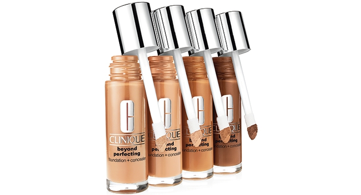
Drake says, “Innovative packaging played a big role in some of our most recent launches. Several enhanced the consumer experience such as Beyond Perfecting Foundation with a built-in applicator. Others enabled advancements in formulations such as Fresh Pressed Vitamin A.”
The focused packaging helps ensure beauty customers of a simple selection process at counter or online.
“Clinique’s consistent and straightforward packaging selection supports the consumer’s fast-paced lifestyle,” comments Marisol Simard, president, dandelion clocks, a consulting firm focused on business growth through innovation strategies and creative team dynamics for the beauty industry. She says, “Clinique packaging speaks to her expectations: No muss, no fuss, no confusion. She can start her day feeling in control, and with confidence.”
Brand Recognition
Clinique’s logo, fonts, colors, and packaging componentry have remained consistently simple and easily recognizable over the years, mixing bright silver with pastel shades of yellow, pink, blue, green and lavender. The brand maintains great recognition through these colors and fonts.
Owen says, “The thing that I think is most amazing about Clinique from its inception in the ’60s is that the advertising is always focused on the packaging, the product.
Whether there’s a visual metaphor or the amazing images that Irving Penn shot for us, I think that really helped establish the vision of the brand. It’s always been about the product and the package.”
Drake agrees. “Our packaging has to reflect the brand’s high standards for quality,” she says. “We have stringent testing to ensure that the packaging meets our expectations throughout the life of the product and enhances the consumer experience.”
Jenny Belknap, senior vice president, global consumer and product marketing, Clinique, says the colors used have become product identifiers. She explains, “Product has and will continue to be hero at Clinique. We don’t use faces in our national advertising. When consumers come to the Clinique counter they don’t often come in saying the full name of the product. They’ll come in and say they want the pink jar, or the yellow lotion. There is a really deliberate and beautiful synergy in how the product and packaging come together that connects with the consumer.”
Clinique’s “modern and fresh” look is one of the reasons Andrew Capper, creative director at Echo Brand Design, feels that the company received its title of Beauty Company of the Year: Excellence in Packaging. He says Clinique is “a perfect example of elegant, stripped-back clarity in branding and packaging.” The iconic silver typography and word mark is designed to work boldly across all packaging variants, he explains, and the secondary type works perfectly to offer range architecture and clarify consumer choice. “The simple bold use of type for Clinique’s word mark means that the brand is able to have more creative freedom introducing new colors, finishes and patterns to their background packaging design and secondary packaging.”
Despite this flexibility, Capper says a bold simplicity reigns at Clinique, which gives the branding and packaging “a sense of stripped back perfection, prestige and true quality, as well as keeping it modern and fresh.”
Evolution Versus Revolution
Clinique may qualify as that rare legacy brand with an Indie approach, keeping its iconic products and “clean” packaging, while creating new formats and new categories to meet consumers’ needs. The brand has been agile in moving from exclusive availability at department store counters to easy access via additional retailers and online sales and assistance.
“Clinique is a legacy brand to which we owe the in-store skin expert consultation concept, and living proof that establishing a strategy around Her needs and Her evolving lifestyle leads to customer loyalty and other benefits,” observes Simard, of dandelion clocks.
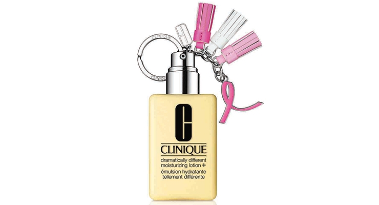
Capper sees Clinique as an iconic beauty brand. “But,” he says, “like the best icons, when a brand reaches this coveted status it gains a new sense of freedom and can introduce new challenging and disruptive behaviors into its design. Similarly, this can be done in a way that, rather than eroding, actually helps build iconic status. We see Clinique behaving this way through exciting limited-edition designs of its stalwart products like the Dramatically Different Moisturizing Cream, for example.”
Mylan Nguyen, packaging analyst at Euromonitor International, agrees. She tells Beauty Packaging the brand has successfully kept up with newcomers: “Aside from the increasing competition from small independent beauty brands, one of the challenges faced by Clinique comes from the fact that store sales, particularly in department stores, account for a large share of the brand sales and footfall, and that retail channel is falling.” She says Clinique’s response to this trend was to ensure that consultants were available online for a live chat on their website, in order to guide and advise customers, while also increasingly being present on social media platforms, with social media influencers promoting Clinique products.
The efforts have apparently paid off. The eighth annual L2 Digital IQ Index: Beauty U.S. ranks the digital performance of 108 brands. Benchmarked categories include color cosmetics, skincare, and fragrance. Clinique ranked No. 6 on the list.
While Clinique’s goals, products and packaging continue to evolve with time and consumer trends, the brand stays true to its heritage. Some products are so aligned with the brand, there’s no reason to change the packaging at all.
It’s all about “evolution versus revolution,” according to Owen. He says, “When working on packaging and package design at Clinique, there are a number of aesthetics and key brand codes that we make sure to approach with reverence and respect for our history, but it’s incredibly important to keep those elements in place as you evolve.” He explains: “Sometimes we make choices that are very much about evolution, and sometimes we make choices that are about revolution, and sometimes we make choices that are really about protecting equity.”
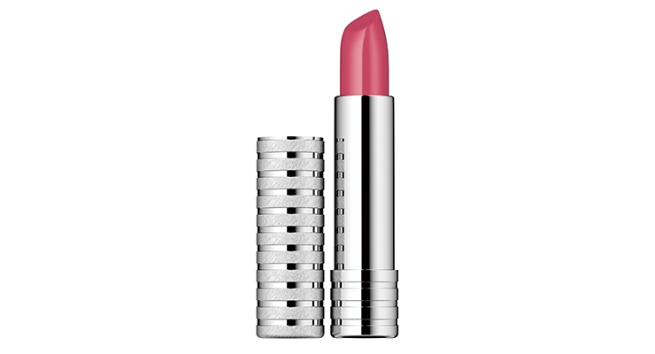
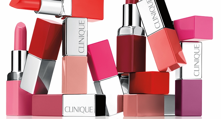
Owen cites Clinique’s classic banded lipstick case as an example of a package that has stood the test of time, with no reason necessary for change. “It is so beautiful for us and that banding is really signature,” he says. “I think it’s understated and it doesn’t have a giant logo on it and is just beautiful in and of itself. I think there’s something about the fact that we still use real materials, like the fact that our lipstick cases are metal and not plastic, I think there’s something about that truth in materials that speaks a lot to the quality of the product.”
Breaking Visual Codes for a Fresh Approach
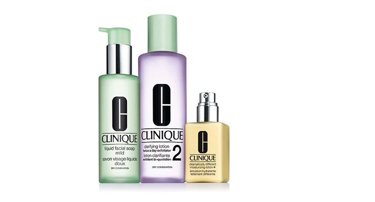
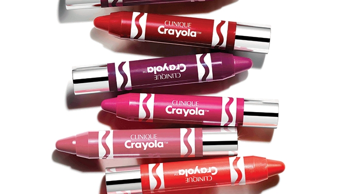
Nguyen of Euromonitor International, describes Clinique’s offers as “distinctively classic,” especially their best-selling 3-Step products range. However, Nguyen says the brand makes a point to introduce new products, breaking its visual codes to inject more freshness into their image. An example of this, she notes, is the brand’s collaboration with Crayola earlier this year [2017], “which became a success story, conveying more playfulness and fun to their chubby sticks.”
Clinique first launched the Chubby Stick in 1997.
Pardo tells Beauty Packaging, that Chubby Stick “was a really interesting thing, when the stars aligned for packaging and a product.” She explains, “It was a fat crayon that gave the consumer an experience that was a bridge between something portable and a full coverage lipstick, and it was a sharpenable.” She says not only was it easy to sharpen, the consumer could get the perfect point, line with it and fill in the full lip.
It was just the beginning of the popular product. The brand re-launched [in 2010] and modernized Chubby [Chubby Stick Moisturizing Lip Colour Balm] again. Pardo says, “It was about taking this no-mirror-required concept to deliver a balm formula that was good for you. The skincare element came first with this wonderful propel-repel package that allowed you to throw your sharpener away.” She adds: “Nothing at Clinique is gimmicky. It needs to be high concept and something that she is really going to love using.”
Owen comments: “There’s something great about the iconography in our Chubby Sticks. We grew up with crayons, which are all about coloring and all about play. That’s a very different position from the way that some brands may be more serious or more high fashion. I think just having that very accessible playful visual really resonates because the first time you see it, you know what it is. I think that attitude is something very important in what we do here at Clinique. When the brand partnered with Crayola, he says, the two brands “brought both color and imagination to life in a vibrant and playful way.”
Special editions and holiday sets also bring additional focus to Clinique.
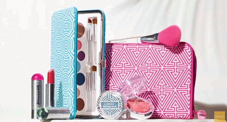
“It is through collaborations that Clinique explores the most,” Nguyen observes. For instance, she points to the brand’s work with the designer Jonathan Adler on a limited-edition range of color cosmetics, “aiming to offer more glamorous makeup products.”
‘Fresh Pressed’ Hits New Stride
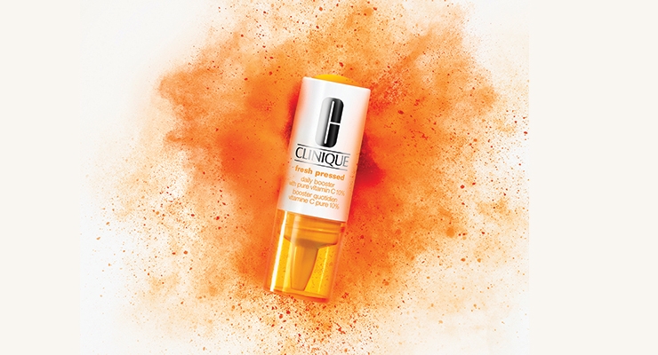
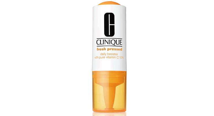
Perhaps this year’s bright orange packaging for Clinique Fresh Pressed Daily Booster with Pure Vitamin C 10% captured the most industry and consumer attention, including two BeautyID Awards presented at Cosmoprof NA: The Grand Award and the Package Innovation-Skincare (Prestige) Award.
Nguyen notes that increasingly, the brand is working with beauty influencers, “which for instance strongly contributed to the success of its Fresh Pressed range this year, largely sharing on Instagram the bright orange packaging, which refers to the product’s Vitamin C content.” This success story, she says, emphasizes the need for Clinique to launch more ‘Instagrammable’ packaging “if the brand continues to aim at widening its consumer base to also include younger generations.”
Owen explains how the Fresh Pressed packaging development generated appeal: “Looking at our recent launch for Fresh Pressed, we took a very complex formula and package, but we delivered it to her [our consumer] in a very simple, easy-to-use and iconic way. That’s something that has always been a hallmark for us, whether it’s Chubby Stick, or Dramatically Different Moisturizing Lotion, or Moisture Surge; it’s just very simple, it’s direct, it’s intuitive. There’s a simplicity in what we do and how we deliver that to the customer.”
Clinique Fresh Pressed Daily Booster with Pure Vitamin C 10% provides a rejuvenating jolt of Vitamin C delivered fresh at the press of a button. The brand says it “harnesses the full de-aging power of pure, potent Vitamin C at our highest concentration to brighten, even and retexturize skin. From the first application, see clinical results and recapture younger-looking skin.” The brand states further, “Like a daily supplement, simply mix two drops with your favorite Clinique moisturizer—or apply directly—to instantly brighten, and in just seven days, see remarkably even-toned, retexturized skin.”
Commenting on the packaging, Drake tells Beauty Packaging, “Fresh Pressed was a great challenge with great rewards. We partnered with our packaging supplier and internal technical teams to overcome several packaging and manufacturing challenges and enable one of our top launches for the year.”
Owen agrees on the product’s great success, saying, “Fresh Pressed has been huge for us. There is something really interesting about taking a product or package that was originally designed for a different industry [pharma], and bringing that into the beauty space. That packaging allowed a new kind of formulation, a new kind of product experience.”
“It allowed us to use very unstable, raw materials that were very difficult to use in packaging and formulating,” comments Pardo. “The fact that we’ve been able to do this has really been a competitive advantage for us that no one else has.” She says this was an example where there was a need and then the form came along. “You know it’s fresh, you hear the crack of the packaging opening. It’s multi-sensory really. It’s also very, very timely, as everything is about freshness right now.”
Belknap adds: “And I think that in the world we’re living in today where people take a picture or video of absolutely everything, the satisfaction of activating this booster is second to none. I can’t think of another product out there where you hear it, you see it, you shake it, there’s just this huge level of satisfaction.”
It’s All in the Experience
Fresh Pressed may have hit a new plateau in experiential packaging and product use, but according to Pardo, it’s a “formula” Clinique follows with many of its launches.
“It’s all about the products and the results,” says Pardo. “It’s about how you make the products work better and her experience with them. I think going back to when we updated our eyeshadows, we wanted to make sure that the customer could easily navigate. It was that idea of having that classic silver but also being able to just turn that compact over and see the eyeshadow shades, whether it is a single, or a duo, and what the shades are inside. It actually makes it very easy for her, and it’s something that’s really beautiful. People love color and it’s very emotional, but having that simple functional element I think is very Clinique.” She says it was the same with Clinique Pop Lip Colour + Primer. “We created an outer packaging that made it easier for a woman to identify the shade of lipstick in her purse because, as we know, she often doesn’t just carry one. You can also use that case as a mirror when you’re putting it on. It’s both beautiful and practical.”
Similar to finding an innovative partner supplier for Fresh Pressed, Beyond Perfecting Foundation + Concealer [a 2015 launch] was another “meeting of the minds between Product Development and our packaging teams,” according to Pardo. She tells Beauty Packaging, “Inspiration truly can come from anywhere. We are always traveling and meeting with different vendors and sometimes you have an ‘aha’ moment; for example, why not just change the scale on everything, and have the benefits of something that most people think about exclusively for a lipgloss or a concealer, and scale that up, so that it’s full face. A doe foot on steroids. We then took it even further, why not call it a concealer and foundation in one? We all know women do it, so we gave them permission along with a big fat doe foot that became a tool she can just paint her face with wherever she has a problem. It can be used all over the face, she can go over it twice, touch up with it, use it as a concealer, cover a blemish, and contour with it. She can even use two shades to get a contoured sculpted look. The possibilities and play time are endless, so much so that it took off from a social standpoint because it is just so visual.”
Entering A Whole New Category
In 2017, with an eye on the growth of the athleisure trend, Clinique entered a new consumer domain—and moved away from its traditional packaging to a more “revolutionary” format.
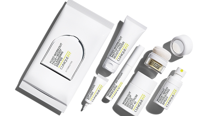
Owen tells Beauty Packaging: “We entered a whole new category in 2017 with the introduction of CliniqueFIT, and the pioneering of athleisure within the specialty-multi distribution channel.” He explains, “This was really radical for us in terms of moving away from folding cards and producing pouches. With CliniqueFit we really focused on the graphic. The iconography is a completely different color for us, and the copy, everything, on this particular franchise has been pretty exciting.”
Pardo explains the launch. “The lines are becoming increasingly blurred between fashion, health, exercise, nutrition and beauty,” she says. “We are seeing a rise in women committed to living an active and healthy lifestyle which has infiltrated all aspects of her life. She is demanding so much more of her beauty regime; she wants to look good while working out, but without sacrificing the efficiency of her products. Her makeup has to endure with her.”
Clinique found that the active consumer was not being served by what is currently offered on the beauty market, says Pardo. “Where the innovation lies is formulating products that have the endurance and stamina to keep up with her, but first and foremost are right for skin.” As always, she says, “Optimum, healthy skin remains Clinique’s Number One priority.”
CliniqueFit is described as a carefully curated line of athletic-inspired, high-performance skincare and makeup that’s long-wearing and designed to “fit seamlessly into your on-the-go lifestyle.” The line includes Workout Makeup SPF 40, a lightweight foundation with SPF protection that wears for a full 12 hours; a 24-Hour Mascara; Post-Workout Mattifying Moisturizer; Workout Face + Body Hydrating Spray; Post-Workout Neutralizing Face Powder; Lip + Cheek Flush; and Post-Workout Face + Body Cleansing Swipes.
Looking Ahead
What can we expect from Clinique in coming years? Most likely luxurious, efficacious formulations housed in a continued mix of packaging ranging from evolutionary to revolutionary.
Belknap tells Beauty Packaging: “Looking to the future, we will continue to double-down on our hero product categories, moisturizers and foundations, to ensure that we deliver to our customers high-performance, innovative products, formulas and packaging that easily fit into her life and answer her needs, and that live up to our safety and allergy testing.”
On a personal note, Belknap says: “I come to work every morning because I believe the products we’re delivering to women are making an impact on their lives, making them happy and I believe, improving their lives. I think a lot of that has to do with the confidence we give her; providing her with high-quality, iconic skincare and makeup products that work immediately and over time to improve her skin. I feel incredible ownership and when you’ve designed a product she trusts and a package she loves, because it’s the first thing she’s touching in the morning—maybe now after her phone—the last thing that touches her before she goes to bed; to be a part of her life, that’s really special.”
Andrew Capper, creative director at Echo Brand Design
“Clinique’s brand packaging has a timeless quality that means it can easily move with the times, keeping ahead of the game whilst staying true to itself. It manages to transcend geographical boundaries as its ranges balance individualism with global brand status. The bold clarity of its identity allows it to behave playfully when required through bold color popping or limited-edition patterned graphics. Rather than dilute the brand, this behavior adds to its appeal. Over and above this, however, it is Clinique’s simplicity combined with the true quality feel of its packaging design that has made it particularly appealing in 2017. This past year, consumers have craved an uncluttered, stripped back and refined look and feel. For this to work, packaging design must exude quality and Clinique does this brilliantly through the use of textures, embossing and the marrying of gilt with soft structural curves—as well as its clean typographic style.”
Mylan Nguyen, packaging analyst at Euromonitor International
“Clinique is a brand recognized globally, in many countries, and is viewed as an affordable luxury or introductory brand. It has a reputation for high-quality innovation, although it has come under extreme competitive pressure from the growing interest in pharma and dermatologist-endorsed niche brands, as well as from other premium brands competing on the basis of higher efficacy.
In terms of packaging, Clinique’s offers are distinctively classic. I have in mind their best-selling 3-Step products range. However, the brand makes a point to introduce new products, breaking its visual codes to inject more freshness into their image.”
Marisol Simard, president, dandelion clocks
“Clinique’s consistent and straightforward packaging selection supports Her [the customer’s] fast-paced lifestyle. Clinique packaging speaks to her expectations: No muss, no fuss, no confusion. She can start her day feeling in control, and with confidence.
Clinique stands out by being consistent and unwavering—and continues to be an ‘about her’ brand that delivers year after year. It is distinct by making Her the inspiration. Clinique storytelling is likely to remain relevant and feed itself, year after year. Why? Because the Clinique story is about Her goals, Her challenges, Her dreams, Her reality… She is the story. The packaging offers appeal by projecting confidence with a capital C (like their logo). Clinique does not have an identity crisis. Clinique is a mature brand, aware of what it stands for. Confidence attracts.”

