Jared Mirsky12.06.21
Market research firm Million Insights reported in January 2021 that the global CBD skin care market is expected to reach $1.7 billion by 2025. That’s a 32.9% compound annual growth rate from 2019 to 2025. To be blunt, any skin care brand that’s not getting into this category is leaving money on the table. But breaking into the market is much more nuanced than adding CBD to an existing formulation and dropping the product into a green box. Product quality and brand promise still rule the day.
In 2019, the “American Time Use Survey” by the U.S. Department of Labor revealed that women drive 70-80% of all consumer purchasing in modern households. Women also spent 130 minutes a day on household chores (37% more time than men), and 95 minutes caring for other family members (nearly twice that of men). Therefore, creating multi-use, multi-purpose products for modern women is key. A skin care product or supplement that also offers CBD’s popularly lauded benefits (anxiety relief, sleep enhancement, or even sunburn relief) would naturally appeal to this time-pressed, stressed out shopper.
A few years ago, I had the opportunity to speak at the Women of Cannabis Conference. One of the seminars was focused on feminine intimacy products (okay, let’s just say it: lube), that included CBD in their formulations. My key takeaway from the talk was that packaging or color matter to women a whole lot less than quality. The key concern needs to be making sure that your company’s products are executed with the best ingredients possible and that you’re always mindful of formulations and material, particularly if this product is going in or on her body or that of her family.
The Role of Color
Now that’s not to say that packaging is not a key consideration as part of your marketing arsenal: it is. While color is key, it’s also subjective. As we mentioned, it’s important to keep in mind that you can’t just make the box pink to show that it’s feminine, or green to communicate that it contains CBD. However, I like to point out the Apple approach: When the brand’s phone palette included silver and space gray, its rose gold hue seemed to naturally appeal to women. If the core features are the same, color can make a product feel that much more personal. It can also help if the buyer knows a product’s color is going to look good with what he or she is wearing, particularly if, like a phone, it’s destined to become an everyday accessory.
3 Categories of Packaging Aesthetics
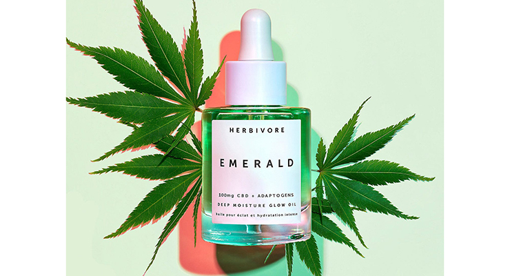
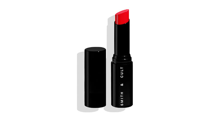
A quick, unscientific survey of CBD beauty products’ packaging aesthetics currently seem to fall into three general categories that we’ll call laboratory, granola, and euro/vintage. Laboratory embraces the clean, white or clear modern look of many popular cosmetics brands (think Clinique or Aesop); a perfect solution if the product is considered part of a complex skin care regimen.
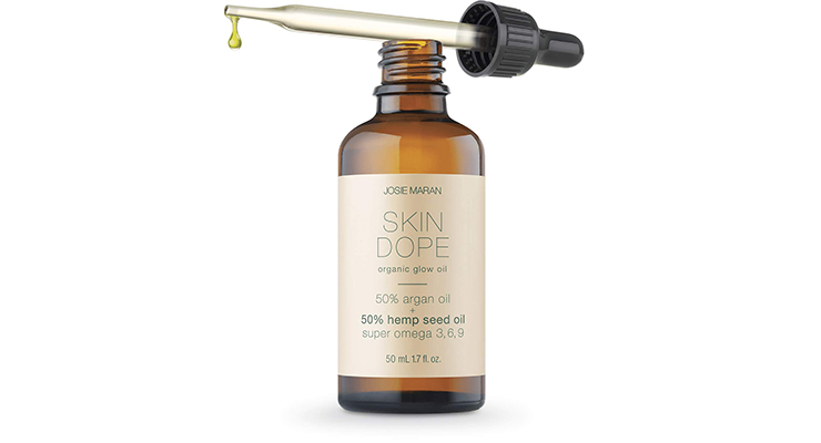
Granola is very earthy, with packaging that’s reminiscent of essential oils or homeopathic remedies with brown paper and glass packaging. Conscious shoppers may be looking for earth-friendly packaging, and women, as the family’s dedicated shoppers, may also be more traditionally empathetic and concerned about the environment.
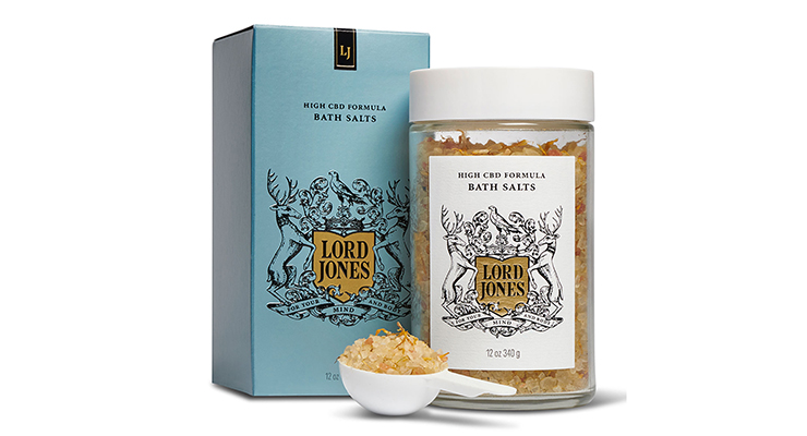
The Euro/Vintage style features retro prints or heraldic imagery reminiscent of Liberty of London or even Game of Thrones. This seems targeted to a younger customer who may also be into thrift fashion, or who wants a package that looks appealing when she pulls it out to use in public.
They’re all great, assuming the brand has a solid understanding of its target customer, but the complete package message must be carefully tailored to the consumer. Here at Wick & Mortar, we think it’s most important to remember that the average customer is typically in a rush—especially women—and so they tend to gravitate to brands with clean and minimal packaging.
Simplicity makes the critical information easy to find, and stands out on a shelf of busy designs and alphabet soup. Our most common requests from clients are “Can we add this?” or “Can we make this bigger?”
Understandably so. It can be tempting to cram as much stuff onto your packaging as possible, but the key is understanding the psychology of your customer, and that when it comes to packaging design, less is more.
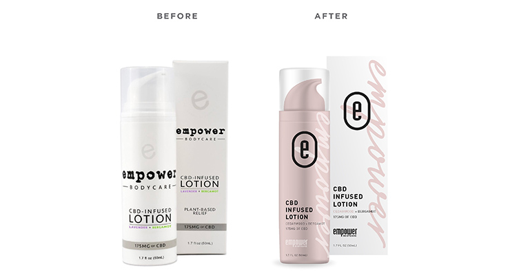
As an example, one of our recent clients, Empower Bodycare Company, came to us with the goal of elevating its brand identity. We started by addressing the product typography, going for something bold and powerful to match the powerful name and product benefits. We then created a graphic language incorporating brand colors and iconography. All of these steps not only served the goal of uplifting the brand’s identity, it also made a clearer packaging message so busy shoppers could easily make fast decisions. We went on to address package design, creating a suite of products that clearly communicated use and function, but that also would display nicely in store, online, or on the user’s bathroom counter.
In the CBD beauty category, as in so many others, keep in mind that women are usually the ones making purchasing decisions. While quality and safety are key, it’s important to remember that modern women are busier than ever, so creating products with multiple purposes, where possible, goes a long way. Success also depends on creating packaging that is easy to identify and easy to use, and that clearly and succinctly communicates the brand promise and product benefits. In this case, putting the package in a pink and/or green box may be the right thing to do, after all.
ABOUT THE AUTHOR
Since 2009 Jared Mirsky and his award-winning cannabis-focused branding and marketing agency, Wick & Mortar, have been featured in dozens of magazines including Entrepreneur Media, Forbes, National Geographic, Wired, Cheddar, Huff Post, and CNN Money. Mirsky continues to shape an industry and is now a regular contributor to Forbes, High Times, Entrepreneur, and The Fresh Toast.
Rebranding Cannabis is his mission, and he aims to accomplish this by helping to educate the industry on the power of successful branding in the cannabis space and the impact it has on the world.

