Shayne Tilley, Head of Marketing at 99designs by Vista02.02.22
It’s the time of year marketers start looking ahead to new product launches and brand makeovers on the horizon. With this in mind, it’s also an ideal time to take a look at some of the packaging design trends gaining traction right now moving into 2022.
One thing that seems clear is that consumers are increasingly looking for sweetness, light and a little bit of whimsy and nostalgia in their personal care and cosmetic products. Here are three of the strongest themes that are likely to dominate packaging in the beauty industry this year.
1. Color Mists
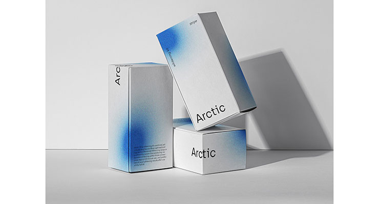
In this trend, solid white packaging gets a lively boost from a spray of misted color pops. Graphic designer Tessa Forrest is widely credited for kick-starting this magical and somewhat mesmerizing trend, which can now be seen all over Instagram.
This Daylight skincare line (designed by Jérémie Awolou), for example, uses a vibrant burst of bright orange blurred out in a misted edge for a uniquely arresting look. The Arctic Teeth Whitening Kit (designed by adamk), uses a less expected, more asynchronous pop of royal blue against its bright white box to achieve a similarly dramatic effect.
2. Y2K Aesthetic
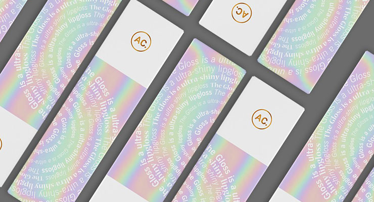
The Y2K aesthetic, characterized by pale blues, purple, silvers, white and pale neons and the generous use of geometric shapes, has taken over much of the branding and design world this year, driven seemingly by nostalgia and a touch of irony. “Retro-futuristic” designs provide a chance to wink at the fashion and designs of the late ‘90s—early 2002s, and it’s definitely one of the hottest trends to hit the beauty world. Examples include Maybelline Magnum Volume Express mascara’s use of bright yellow, lilac and black, and this lip gloss packaging by AnaHola, which leans on the pastel metallics to make a statement.
3. Serenity & Calm
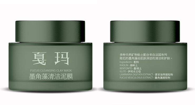
At the other end of the spectrum from the noisy and chaotic Y2K aesthetic is an equally strong trend among brands to embrace serenity and calm in their designs. An increasing number of brands are using muted, complementary hues along with minimal typefaces and simple copy to achieve a sense of relaxation and zen, for example this Body Religion hemp oil or the Onsen Bath Soak.
About the Author:
Shayne Tilley is Head of Marketing at 99designs by Vista, the global creative platform that makes it easy for designers and clients to work together to create designs they love. He is a wrangler of collaboration, diversity, and creativity who helps bring more opportunities to people all around the world. 99designs.com


