06.07.23
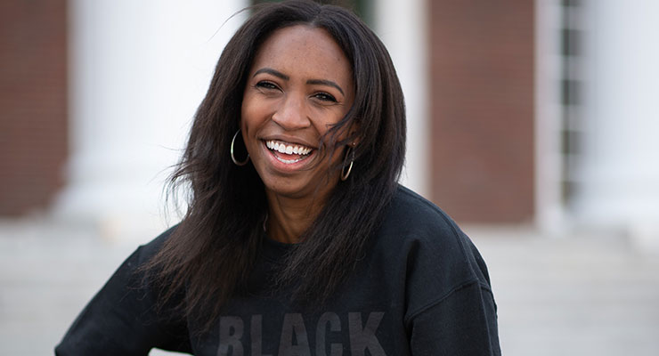
Founded by Keta Burke-Williams, a female entrepreneur with a Harvard Business degree, Ourside is a newly launched luxury clean fragrance line that’s cruelty-free, vegan-friendly and made in the U.S. It has garnered great reviews as a ‘responsibly made’ fragrance.
Ourside was selected as one of eight BIPOC brands that are members of Ulta Beauty’s inaugural MUSE Accelerator 2022 program cohort, Tower 28 Clean Beauty Summer School 2020. In addition, Burke-Williams was selected to be personally mentored by Credo founder Annie Jackson for Credo for Change 2021.
Burke-Williams says her intention is to bring a Black voice into the fragrance market and to develop scents intended for self-care and connection based on love and community. Ourside was inspired by her mother and a recurring story she told of walking in a garden in Tunisia surrounded by night-blooming jasmine.
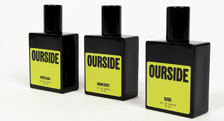
The line launched with three fragrances: Nostalgia (a floral, jasmine forward woody scent); Moon Dust (a citrus bergamot forward earthy/vetiver scent); and Dusk (a fruity fig forward ambery scent). A Discovery Kit with 2ml of all 3 fragrances is $27; 10ml rollerball, $79; and 50ml, $196 each.
She says, “For the packaging, we wanted to create a bold and grounded feel, as highlighted by our color palette. We have a big vision and clear values and we wanted that to come to life visually as well.”
Further, “We wanted the packaging to convey the idea that we are confident in what we stand for and believe in, but we aren’t shouting it from the rooftops. There’s this approachable aspect to the packaging that we accomplished by sharing some of our brand story on it. Instead of telling you our name and assuming you know about us and who we are, like some typical luxury brands, we wanted our packaging to help us tell the story, so the copy we placed on it was important, too.”
She says, they opted for black bottles “because again, it’s revoking the tradition that fragrance bottles need to look one way or another. By contrasting the label colors with the black, we’ve created an experience that can find itself on a Gen Z vanity, but also on a Millennial or Gen X one. It is modern, sleek, and a little playful. We also intentionally wanted to keep the branding unisex since our fragrances are not gendered, and from responses so far, we’ve done a good job of that.”
“We wanted to keep the packaging light and paper-based for our sustainability efforts, and worked to see how we could still make it feel luxurious and special. We opted for a soft-touch coating, which creates a special tactile feel while still enables it to be easily recycled.”
Overall, Burke-Williams says, “We use the space on the packaging to tell key components of our brand story and the daydreams that inspired the scents.”
Ourside was selected as one of eight BIPOC brands that are members of Ulta Beauty’s inaugural MUSE Accelerator 2022 program cohort, Tower 28 Clean Beauty Summer School 2020. In addition, Burke-Williams was selected to be personally mentored by Credo founder Annie Jackson for Credo for Change 2021.
Burke-Williams says her intention is to bring a Black voice into the fragrance market and to develop scents intended for self-care and connection based on love and community. Ourside was inspired by her mother and a recurring story she told of walking in a garden in Tunisia surrounded by night-blooming jasmine.
The line launched with three fragrances: Nostalgia (a floral, jasmine forward woody scent); Moon Dust (a citrus bergamot forward earthy/vetiver scent); and Dusk (a fruity fig forward ambery scent). A Discovery Kit with 2ml of all 3 fragrances is $27; 10ml rollerball, $79; and 50ml, $196 each.
Packaging and Branding
Burke-Williams tells Beauty Packaging that they were fortunate to partner with the branding agency Some Days to bring Ourside to life.She says, “For the packaging, we wanted to create a bold and grounded feel, as highlighted by our color palette. We have a big vision and clear values and we wanted that to come to life visually as well.”
Visual Branding
They wanted to use the visual branding “to carry forward our brand story and essence.” With Ourside, she explains, “We set out to create a World of Our Own, and do it through fragrance and scent, because it’s our strongest sense. We have a clear, strong message and wanted to develop a visual identity to convey it. We created a bold, almost poster feel, and juxtaposed it with colors and typeface that bought an almost humanlike quality to it.”A Brand & Packaging Disruptor
In addition, says Burke-Williams, “We wanted our brand and packaging to make people stop and look, so we opted for colors that we see a lot less of in traditional beauty and luxury packaging. Instead of all muted tones, we chose an almost lime green for an unexpected splash of color. We decided to take a chance and do something that looks totally different than what’s out there today on typical fragrance shelves. As the disruptors, we want our fragrances to smell different than what exists and the packaging to look different as well.”Further, “We wanted the packaging to convey the idea that we are confident in what we stand for and believe in, but we aren’t shouting it from the rooftops. There’s this approachable aspect to the packaging that we accomplished by sharing some of our brand story on it. Instead of telling you our name and assuming you know about us and who we are, like some typical luxury brands, we wanted our packaging to help us tell the story, so the copy we placed on it was important, too.”
She says, they opted for black bottles “because again, it’s revoking the tradition that fragrance bottles need to look one way or another. By contrasting the label colors with the black, we’ve created an experience that can find itself on a Gen Z vanity, but also on a Millennial or Gen X one. It is modern, sleek, and a little playful. We also intentionally wanted to keep the branding unisex since our fragrances are not gendered, and from responses so far, we’ve done a good job of that.”
Secondary Packaging
Non-traditional elements also played a role in Ourside’s secondary packaging. They use a combination of Farmacia and Kommuna fonts to bring their brand story to life on their packaging, which is printed on FSC certified paper (sourced from the U.S.) in New Jersey.“We wanted to keep the packaging light and paper-based for our sustainability efforts, and worked to see how we could still make it feel luxurious and special. We opted for a soft-touch coating, which creates a special tactile feel while still enables it to be easily recycled.”
Overall, Burke-Williams says, “We use the space on the packaging to tell key components of our brand story and the daydreams that inspired the scents.”


