09.19.23
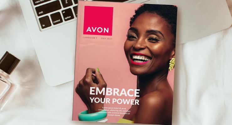
Last year, Avon, the global cosmetics company, appointed creative agency Free The Birds to transform its brand identity to better reflect the brand’s new “Embrace your Power” positioning.
Over the years, Free The Birds has developed a reputation for branding and design within the beauty and wellness industry, having completed successful brand refreshes for leading multinationals such as P&G, Boots and Coty.
In Avon’s case, Free The Birds conducted an audit into the current positioning of Avon globally and recognized that its identity had been “diluted over time” and had become inconsistent across platforms.
The solution was a branded house approach: one cohesive strategy with a new visual identity for all brand channels and applications to exist under.
Nick Vaus, Partner and Creative Director at Free The Birds explained: “Avon is an iconic beauty brand with true purpose on a global scale. But like all heritage brands it needs to stay relevant and that requires purposeful transformation. It became very obvious very quickly the power and potential a total brand identity refresh would unlock.”
Hear Vaus talk sustainable packaging with Beauty Packaging.
Brand equities include brand color, primary typography and other brand elements including photography style, advertising layouts, brand guidelines and brand visual personality. All of which ladder up to Avon’s new “Embrace Your Power” brand positioning. The result is a new visual identity which celebrates the brand's belief that every woman is born with her own unique power.
The rebranding campaign is rolling out from now across Europe, Middle East & Africa, South Latin America, North Latin America, and Asia Pacific territories.
“The aim with this rebrand was to celebrate Avon’s USP in the market which has always focused on creating products that help our customers feel the best version of themselves,” commented Kristof Neirynck, CMO at Avon. “Working with Free The Birds allowed us to bring the Avon brand in line with this bold level of multi-channel transformation, and we’re thrilled with the outcome of the collaboration on this project.”
Over the years, Free The Birds has developed a reputation for branding and design within the beauty and wellness industry, having completed successful brand refreshes for leading multinationals such as P&G, Boots and Coty.
In Avon’s case, Free The Birds conducted an audit into the current positioning of Avon globally and recognized that its identity had been “diluted over time” and had become inconsistent across platforms.
The solution was a branded house approach: one cohesive strategy with a new visual identity for all brand channels and applications to exist under.
Nick Vaus, Partner and Creative Director at Free The Birds explained: “Avon is an iconic beauty brand with true purpose on a global scale. But like all heritage brands it needs to stay relevant and that requires purposeful transformation. It became very obvious very quickly the power and potential a total brand identity refresh would unlock.”
Hear Vaus talk sustainable packaging with Beauty Packaging.
New, Consistent Visual & Verbal Identity
The re-energized brand world spans across visual and verbal identity, including a new hallmark logo, packaging design, website and social media assets.Brand equities include brand color, primary typography and other brand elements including photography style, advertising layouts, brand guidelines and brand visual personality. All of which ladder up to Avon’s new “Embrace Your Power” brand positioning. The result is a new visual identity which celebrates the brand's belief that every woman is born with her own unique power.
Redesigned Logo
Free The Birds housed the hallmark in a strong plinth shape with a strong color. The impactful ‘iconic power pink’ is optimistic, bold and mobilizing and also reflects brand values, such as the brand’s longstanding commitment to the breast cancer cause. As well as using new brand colors to reflect Avon’s new positioning, Free The Birds partnered with Dalton Maag to evolve the typeface for Avon, remaining true to the original to ensure brand recognition, but refining the font to create more balanced letter forms.The rebranding campaign is rolling out from now across Europe, Middle East & Africa, South Latin America, North Latin America, and Asia Pacific territories.
“The aim with this rebrand was to celebrate Avon’s USP in the market which has always focused on creating products that help our customers feel the best version of themselves,” commented Kristof Neirynck, CMO at Avon. “Working with Free The Birds allowed us to bring the Avon brand in line with this bold level of multi-channel transformation, and we’re thrilled with the outcome of the collaboration on this project.”


