Ben Oates, executive creative director, JDO08.09.18
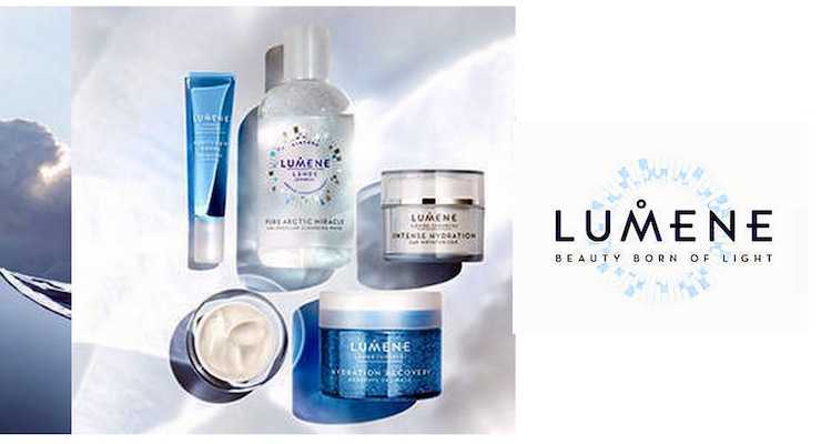
On the edge of the Arctic Circle, there’s a land of lush-green forests and crystal-blue lakes that throughout the summer months bathes in the glow of natural daylight from dawn until dusk. Naturally blessed by geography, Finland is a nation with the purest water in the world and the perfect, fertile territory for producing ingredients rich in antioxidant qualities. And it’s the purity of these elements that are the inspiration behind the country’s market-leading skincare brand, Lumene.
Founded in 1970, Lumene has been described as Finland’s best-kept beauty secret, with formulas very much borne of the landscape and well-being rituals of Northern Finland. Elements such as tree bark, cloudberries and the Chaga mushroom – also known as ‘the mushroom of immortality’ – are bottled at source to create a range of products with almost magical therapeutic properties.
Unique Identity
JDO’s challenge was to design a brand identity that truly reflected this essence. We had to distil our thinking to a single, core idea that would illuminate everything from the brand’s packaging and products through to the retail experience. Crucially, this idea had to resonate with consumers, creating an emotional connection that spoke to the company’s heritage and homeland.
Working with the marketing and communications team, our answer was to bring everything back to the rejuvenating and almost-spiritual quality of the Arctic summer sun – the luminescent life-force which awakens Finland from the depths of winter darkness to bring a natural glow to the skin. The result was the central theme of ‘beauty born of light’, generating a look and feel that is instantly recognizable as Nordic to both the local audience and rest of world.
Visual Thread
To visually bond this concept to the Lumene brand, we created the ‘wheel of light’, a central recognizable motif that reflects the annual cycle of the sun. With a range covering over a hundred SKUs, from everyday cleansers to super-premium anti-aging elixirs, this provides a strong visual thread to unite and harmonize the various products.
The cycle of light is also echoed in the circle that forms part of the logo type, which itself uses a bespoke font with angular strokes and slightly extended crossbars to blend Nordic chic with cues from the beauty sector.
Minimalist Cool
In the context of an exceptionally competitive beauty market, Lumene’s packaging design also demanded a fresh consideration of luxury. Rather than the typical warmth and richness, the brand’s inherent minimalism and coolness were made to be strengths, using techniques such as blind embossing to underline the quality of the products.
Beyond the packaging itself, light has been used as the brand’s continuous, guiding, creative force: it infuses the website design, it is present in point of sale materials, and it is a particularly strong feature at retail.
Here, we were able to bring the wheel to life in a three-dimensional sculpture built in real lights that shimmer and subtly change colors like the Aurora Borealis; display screens are incorporated to allow forest scenes to play out; and every surface – even drawers – incorporate lighting to link back to the central concept. On top of that, the fixtures were shaped in wood by local craftsmen using traditional methods.
Combined together, all of these elements form a powerful visual ‘language’ that creates an emotional connection between consumers and the brand, bringing the Lumene story to life and bringing the beauty secrets of this special place to the wider world.
See more of JDO's work with Lumene on the company's website.

