Jamie Matusow, Editor-in-Chief09.03.15
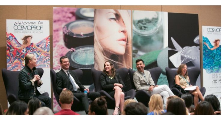
At Cosmoprof NA, a panel moderated by Beauty Packaging’s editor-in-chief Jamie Matusow brought together cosmetics industry experts to express design, brand and supplier viewpoints regarding optimal brand packaging. Panelists were Ben Bennett, partner & co-founder, creative director, Hatch Beauty; Lauren Wolk, vice president of sales, Goldfaden MD; Nick Gardner, executive vice president, HCT Group; and Jerrod Blandino, co-founder and creative director, Too Faced Cosmetics.

Jamie Matusow
The conference highlighted how Hatch Beauty and their client, Goldfaden MD—and HCT Packaging and their client, Too Faced—work together to ensure that the brands’ DNA comes through via the story that the packaging tells.
Ben Bennett started the discussion by saying how he loves working with entrepreneurial firms “that have a fire in their belly to grow”—such as Goldfaden MD.
Lauren Wolk introduced Goldfaden as the first Dr. brand that was developed combining natural ingredients and dermatology in one. The products are sold in prestige—as solutions to skin care problem. In 2012, working with Bennett, they underwent a full rebranding and repackaging. Why? Because upon the original launch, Goldfaden had loved the products, but felt they hadn’t spent enough time on the packaging to really communicate the message properly. And, according to Wolk, “they’d lost out on-shelf” as a result. So they chose Hatch to re-communicate their message.
In addition to the re-design and repackaging, Hatch also helped to re-reposition the brand. Bennett explained that consumers didn’t know just by looking at the original packaging that it was a “natural” range. These were performance-based products that Dr. Goldfaden—who was seated in the Cosmoprof audience—used in his office, and thus, had to come across as such.
Bennett said that for the secondary packaging, they “said goodbye to the red and gold palette” and instead, chose an acidic green—and also added MD to the Goldfaden name to add authority. A flag was added to the front of the carton to easily identify the skin problems it was meant to correct. He said now “it almost felt prescription-like.” Wolk said they wanted consumers to understand the product/need in 30 seconds—and wanted it to act as an “at-home prescription.” Instead of botanical images on the outside of the box, in this case, they appear on the inside, once the flap is opened.
A change in primary packaging materials was also part of the re-packaging. While Goldfaden had originally used glass to sync with its natural products, the range was switched to modern, customized airless packaging for high-shine visibility, product protection and perfect dosing. There’s even an explanation of the switch in materials right on the carton.
But the brand retains a passion for glass and for recyclable materials. One of Goldfaden’s newest products, Fleuressence, a golden elixir oil, is going back to glass as it’s ideal for the formulation. The striking die cut box with a window that shows the product, was itself, inspired by an oil droplet. The glass feels very robust, says Wolk, and the button dropper dispenses the exact amount—critical for prestige consumers who pay $129 for the product.
A new range, Plant Profusion ($125-$235), is set to launch this fall. It utilizes glass for the primary packaging—glass that feels very heavy, according to Bennett. He said the champagne gold color, achieved with a customized spray feels unique, and adds that the bottles are recyclable. “Elevated set up boxes, situated on gold metallic platforms, make the product seem like a luxurious gift,” said Wolk.
HCT and Too-Faced
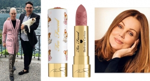
Too-Faced’s Jerrod Blandino and HCT’s Nick Gardner spoke about a couple of the brand’s most iconic, best-selling products achieved through their partnership. And Blandino—who repeatedly sparked laughter, both among the panelists and with the audience—showed the true personality behind the brand, as well as an acute sense of the cosmetics business and what it takes to be successful. He offered lots of practical advice to up-and-comers in the audience as well as succinctly addressing what it takes to build a loyal following. He spoke about how he had found innovative packaging ideas in seemingly unlikely places, from an organic spa with a chocolate facial to a maccaron shop in Paris.
Too Faced’s Chocolate Bar compact is almost legendary at this point. Blandino offered Gardner high praise for bringing it all together. “HCT takes a dream and an idea and presents it to the consumer,” he said. The “grown-up candy for women” became an internet sensation and a best-seller. “Too Faced is a very emotional brand,” noted Blandino. “It’s fun to be a girl.” The brand’s Sweethearts Perfect Flush Blush is set to follow the same course. “You know you’re doing well in packaging,” said Blandino, “when women don’t want to throw it out—or they just carry it with them because they like it.” His strong advice to the crowd: “You must separate yourself from the others out there—carve a niche for yourself.”
He explained “the more complicated the formula, the more challenging the packaging.” He stressed the role of packaging as it relates to a woman’s lifestyle: “Packaging decorates her bag, her home—it takes her to an emotional level.”
Blandino also said packaging “needs to look expensive and playful” at the same time. He emphasized: “Packaging is your salesperson; get them [consumers] in a quick way.” He added: “If you want to be a leader, take risks—and scare people.”
That’s the philosophy behind the brand’s latest product “Better Than Sex Mascara.”
A few takeaways from the audience’s Q&A portion of the panel:
As general advice, Blandino said: “You have to be in control of what the brand DNA is—and accept that you’ll never be everything to everyone.”
Bennett expressed that “a brand has to create dimension and texture on the landscape of a shelf.”
The important thing is to get the product to launch, said Bennett: “There’s no real right or wrong package to start,” he said. “Get it out the door and learn from that. Then tweak it.”
Jamie Matusow
Ben Bennett started the discussion by saying how he loves working with entrepreneurial firms “that have a fire in their belly to grow”—such as Goldfaden MD.
Lauren Wolk introduced Goldfaden as the first Dr. brand that was developed combining natural ingredients and dermatology in one. The products are sold in prestige—as solutions to skin care problem. In 2012, working with Bennett, they underwent a full rebranding and repackaging. Why? Because upon the original launch, Goldfaden had loved the products, but felt they hadn’t spent enough time on the packaging to really communicate the message properly. And, according to Wolk, “they’d lost out on-shelf” as a result. So they chose Hatch to re-communicate their message.
In addition to the re-design and repackaging, Hatch also helped to re-reposition the brand. Bennett explained that consumers didn’t know just by looking at the original packaging that it was a “natural” range. These were performance-based products that Dr. Goldfaden—who was seated in the Cosmoprof audience—used in his office, and thus, had to come across as such.
Bennett said that for the secondary packaging, they “said goodbye to the red and gold palette” and instead, chose an acidic green—and also added MD to the Goldfaden name to add authority. A flag was added to the front of the carton to easily identify the skin problems it was meant to correct. He said now “it almost felt prescription-like.” Wolk said they wanted consumers to understand the product/need in 30 seconds—and wanted it to act as an “at-home prescription.” Instead of botanical images on the outside of the box, in this case, they appear on the inside, once the flap is opened.
A change in primary packaging materials was also part of the re-packaging. While Goldfaden had originally used glass to sync with its natural products, the range was switched to modern, customized airless packaging for high-shine visibility, product protection and perfect dosing. There’s even an explanation of the switch in materials right on the carton.
A new range, Plant Profusion ($125-$235), is set to launch this fall. It utilizes glass for the primary packaging—glass that feels very heavy, according to Bennett. He said the champagne gold color, achieved with a customized spray feels unique, and adds that the bottles are recyclable. “Elevated set up boxes, situated on gold metallic platforms, make the product seem like a luxurious gift,” said Wolk.
HCT and Too-Faced
Too-Faced’s Jerrod Blandino and HCT’s Nick Gardner spoke about a couple of the brand’s most iconic, best-selling products achieved through their partnership. And Blandino—who repeatedly sparked laughter, both among the panelists and with the audience—showed the true personality behind the brand, as well as an acute sense of the cosmetics business and what it takes to be successful. He offered lots of practical advice to up-and-comers in the audience as well as succinctly addressing what it takes to build a loyal following. He spoke about how he had found innovative packaging ideas in seemingly unlikely places, from an organic spa with a chocolate facial to a maccaron shop in Paris.
Too Faced’s Chocolate Bar compact is almost legendary at this point. Blandino offered Gardner high praise for bringing it all together. “HCT takes a dream and an idea and presents it to the consumer,” he said. The “grown-up candy for women” became an internet sensation and a best-seller. “Too Faced is a very emotional brand,” noted Blandino. “It’s fun to be a girl.” The brand’s Sweethearts Perfect Flush Blush is set to follow the same course. “You know you’re doing well in packaging,” said Blandino, “when women don’t want to throw it out—or they just carry it with them because they like it.” His strong advice to the crowd: “You must separate yourself from the others out there—carve a niche for yourself.”
He explained “the more complicated the formula, the more challenging the packaging.” He stressed the role of packaging as it relates to a woman’s lifestyle: “Packaging decorates her bag, her home—it takes her to an emotional level.”
Blandino also said packaging “needs to look expensive and playful” at the same time. He emphasized: “Packaging is your salesperson; get them [consumers] in a quick way.” He added: “If you want to be a leader, take risks—and scare people.”
That’s the philosophy behind the brand’s latest product “Better Than Sex Mascara.”
A few takeaways from the audience’s Q&A portion of the panel:
As general advice, Blandino said: “You have to be in control of what the brand DNA is—and accept that you’ll never be everything to everyone.”
Bennett expressed that “a brand has to create dimension and texture on the landscape of a shelf.”
The important thing is to get the product to launch, said Bennett: “There’s no real right or wrong package to start,” he said. “Get it out the door and learn from that. Then tweak it.”

