Andrew Capper11.17.17
Undeniably bold, new and exciting rules for color are appearing throughout design in diverse sectors. As the new aesthetic Colour Surge takes over, we’re observing a rise in unusual color pairings in brand identities, brash, bright candy tones in fashion and vibrant colour transitions in consumer products.
A 90s Revival
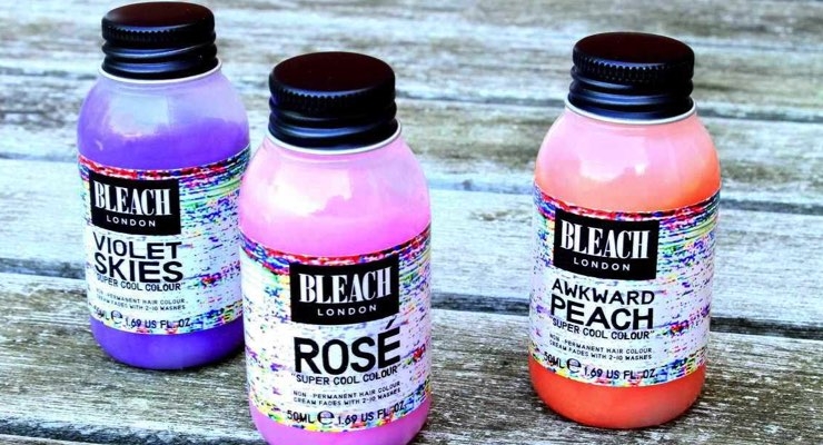
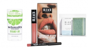
In part, this new aesthetic is driven by a revival of all-things-90’s, with brands such as Bleach London replicating the patterns and party scene of the era. (The brand's bright hair color is shown above).
Arguably, it’s also influenced by the global desire to rebel against the establishment. Just as global issues influenced the rise of mini-skirts in the 60’s and London’s punk scene in the 70’s, today’s climate and era of activism is influencing the way brands are behaving and their use of color through identity.
As people strive to do things differently and reject the original rules in favor of something new, they are looking for brands that reflect these values. In response, beauty brands are emerging with bold, confident expressions that align visually with this mindset for change.
Color Palettes in Beauty Are Inspired by Fashion
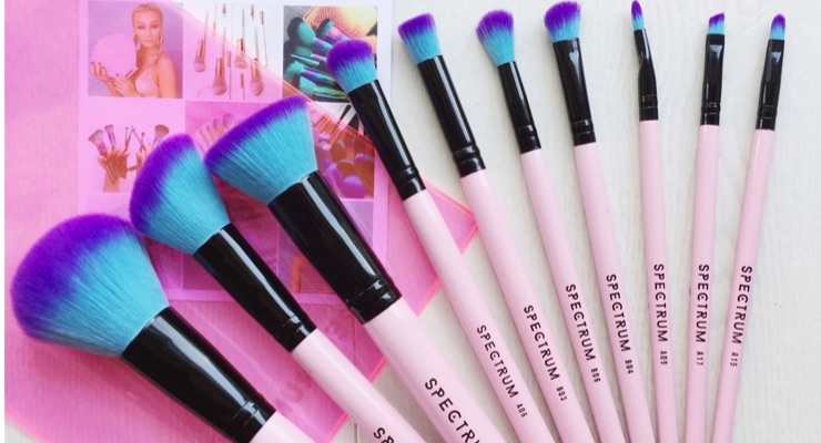
Colour Surge and its rich aesthetic is beginning to transcend the design industry as color palettes in beauty and cosmetics mimic those on the catwalk. Departing from the normal muted tones in the cosmetic brush market, Spectrum Collections has crafted an ‘Instagram-worthy’ range of products. (The brand's brushes are shown above.) Adopting dusty millennial pinks and metallic blues, they reflect the bright and playful colors of the moment.
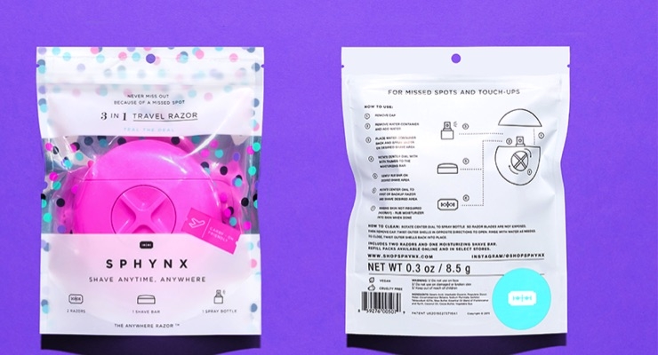
Similarly, Sphynx’s range of travel razors stand out among traditional brands in the female grooming market with their confident use of lucid pinks and electric blues on pack.
In beauty, bright bold use of color was once reserved for more daring brands and consumers, with established brands like MAC and Illamasqua really standing out. But today more and more brands are incorporating vivid color palettes that clash and jump from pack. This exciting rejection of the traditional rules of design and color incorporates unusual colour pairings and daring, clashing prints.
Once used autonomously, brands are no longer afraid of using rich, discordant color tones and energetic patterns in harmony. Designers such as Camille Walala, known for her strong block colors and bold conflicting patterns, are championing this new aesthetic.
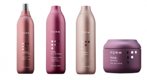
We’re inspired by R+Co’s unique packaging design as they adopt rich colors and saturated photography alongside bold, graphic prints and patterns on their hair care ranges. R+Co’s use of photography with clean, pared-back communications stands out among competitors as rebellious and revolutionary, transporting the consumer in a hedonistic way.
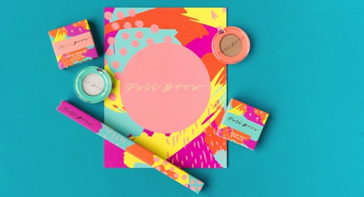
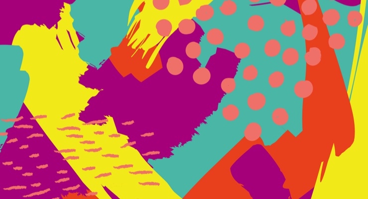
Additionally, we love the graphic identity of Australian brow company Full Brow for their use of playful and lively patterns on pack (one close-up pattern is shown above) where hand-drawn brush strokes and repeated patterns are used with bright, spirited colours.
Colorful lllustrations & Unusual Pairings
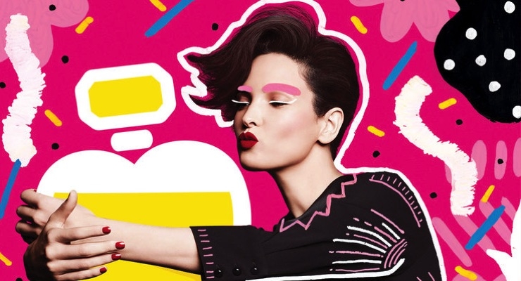
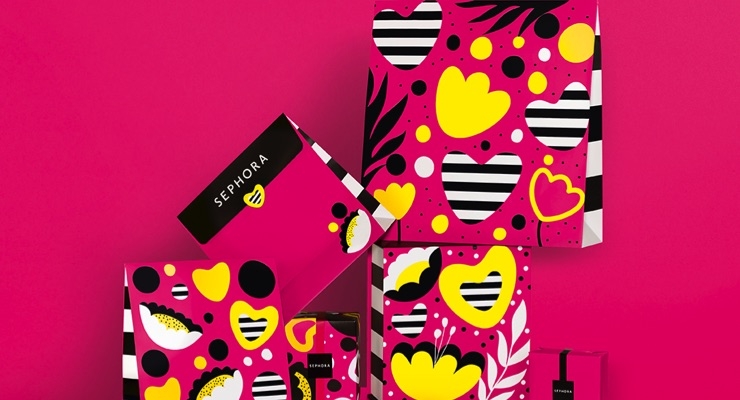
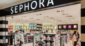
In fashion and interiors, designers and makers are seeking new production techniques to create new bright shades, especially saturated colors. However this isn’t reserved for brands that are already bright and playful. Take inspiration from Sephora, a traditionally monochromatic brand that launched a more disruptive graphic identity as part of their 2017 Mother’s Day campaign. Commissioning Andreea Robescu for her playful illustration style, the in-store decoration and limited-edition packaging incorporated edgy, energetic illustrations and striking highlighter hues. (shown above).
Rich color gradients are used increasingly across lifestyle products and graphic identities as Color Surge celebrates unusual color pairings. Across beauty brand Eva NYC’s hair care range, familiar colors are presented in new ways as vibrant combinations of burnt oranges and rich pinks are used alongside softer, natural tones on pack. We love the undulating nature of the gradient and color transitions that hint at the transformative power of their products.
Incorporating 'Color Surge'
Do you know a brand that could champion a bolder aesthetic?
When incorporating Color Surge into your brand or packaging, the key is to be fearless—there are no half measures. Embrace color clashes and celebrate unexpected color combinations.
Look at the existing color codes for your product market or category, and then break them. And finally don’t be afraid to pair bold colors with an equally bold graphic pattern; with this aesthetic, more is more!
The latest edition of ‘Radar’ ECHO’s design trends magazine is out now. ‘The Design Issue’ explores the visual world’s impacting the brand design and packaging of tomorrow.
This is the second article in Echo's Trends Series. See the first: Trends in Beauty: How To Use Naturalism

