Marie Redding, Associate Editor12.28.17
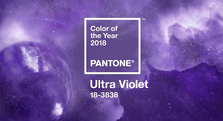
The Pantone Color Institute has announced the Color of the Year for 2018 — Pantone 18-3838 Ultra Violet. The bold color looks elegant and modern.
Color has the ability to convey deep messages and meanings — especially when used by a brand, and for packaging. The Pantone Color Institute, the consulting arm of Pantone (a wholly owned subsidiary of X-Rite, Inc.) forecasts global color trends, advises companies on color in brand identity and product development, and on color assurance programs.
Pantone’s team states, “The Color of the Year is one moment in time that provides strategic direction for the world of trend and design.”
Leatrice Eiseman, executive director, Pantone Color Institute, explains, “We are living in a time that requires inventiveness and imagination. It is this kind of creative inspiration that is indigenous to Ultra Violet, a blue-based purple that takes our awareness and potential to a higher level. From exploring new technologies and the greater galaxy to artistic expression and spiritual reflection, intuitive Ultra Violet lights the way to what is yet to come.”
Laurie Pressman, vice president of the Pantone Color Institute, adds, “The Pantone Color of the Year has come to mean so much more than ‘what’s trending’ in the world of design; it’s truly a reflection of what’s needed in our world today.”
Ultra Violet is Well-Suited for Beauty
Ultra Violet is well-suited for beauty looks created by combinations, blends, and ombres. The color’s mysterious nature, steeped in spirituality, looks “spell-binding” and “expressive,” Pantone’s team states.
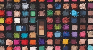
On lips or nails, a singular matte purple makes a bold statement of non-conformity. Transform the eyes into “windows to the cosmos” with softly blended metallics and shimmers in Ultra Violet, Pantone’s team advises.
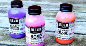
Purple hair color elevates a street style look as a symbol of creative expression.
Several beauty brands are already using the color for both products and packaging — see them in this slideshow, Ultra Violet Beauty.
Ultra Violet in Packaging, Fashion & More
In packaging and graphic design, shades of Ultra Violet are being used by forward-looking brands, to create a multi-dimensional feel.
In fashion, Ultra Violet is easy to pair with different colors, although it may not seem like it at first. Pantone’s team explains that this is because purple is made by combining red and blue. “With golds or other metallics, Ultra Violet becomes luxurious and dazzling; with greens or greys, it evokes natural elegance,” Pantone states.
In home decor, Ultra Violet makes a statement — fitting in with traditional and elegant looks as easily as it does with bold unexpected designs.
Packaging & Printing Tips — Overcoming Ultra Violet’s Challenges
Package development teams and package engineers are often faced with the challenge of working with suppliers to color-match -- and ensure a color looks consistent across a variety of different components and materials. The color-matching process is typically the first step before printing, or other decorating techniques.
Colors such as Ultra-Violet, however, often pose additional challenges. “It is a high-coverage, intense solid, and producing packaging that lives up to a designer’s intent can be difficult,” the Pantone team explains.
During the package design process, the color that appears on a designer’s screen, as well as physical color references, will always change depending on the substrate and printing process.
When reflective, metallic and pearlescent finishes are used, which all pair well with Ultra-Violet and are gaining in popularity in packaging, there are even more challenges. Special finishes and embellishments require different color measurement techniques.
Pantone offers five tips package printers and converters can follow to meet the trend of bold colors and finishes in 2018, in this blog post.
Color Palettes & Inspirations
Need ideas for how to use 18-3838 Ultra Violet - and combine it with other colors?
Pantone created eight color palettes, along with “color harmonies,” to help inspire designers. A mix of brights, deeper hues, pastels, mid-tones, and metallics are included. Each palette conveys a distinctive feeling and mood.
See them here, in this slideshow: Ultra Violet Color Palettes to Inspire Package Designers.
Choosing the Color of the Year
How is the Color of the Year chosen? Color experts at the Pantone Color Institute comb the world looking for new color influences.
These influences include the entertainment industry, films in production, traveling art collections, new artists, fashion, all areas of design, popular travel destinations, new lifestyles, playstyles, and socio-economic conditions. Influences may also stem from new technologies, materials, textures, and effects that impact color, relevant social media platforms, as well as sporting events that capture worldwide attention.
The selected color is often taken from the Pantone Fashion, Home + Interiors Color System, which is the most widely used and recognized color standards system for fashion, textile, home, and interior design.
A Look Back
Pantone Color of the Year 2017 - Greenery
Pantone Color of the Year 2016 - Rose Quartz & Serenity

