Willie Tsang, founder and CEO of Way of Will04.11.19
Many entrepreneurs might underestimate the power of product packaging when it comes to determining success, but it is a crucial eye into the soul of a business. Some would argue that the quality and usefulness of the product itself are what draws consumers in, but packaging plays an enormous role in determining consumer decisions, or so we’ve learned here at Way of Will.
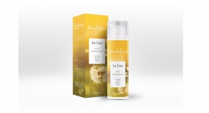
As a natural skincare and essential oils brand for active lifestyles, we were in the initial stages of launching our newest Brightening Face Serum in the popular beauty and wellness subscription box, FabFitFun, when we experienced printing issues on the packaging. The packaging color turned out to be a very bright yellow, making it almost impossible to read the white print. Color is such a small difference with a potentially huge impact that we just didn’t realize.
We decided to roll with it and sent 300,000 units of product to FabFitFun, where 1 million of their subscribers would receive it as the mystery item in their Winter 2018 box. An unexpected packaging mishap turned into a marketing miracle. Traffic to the Way of Will website nearly tripled. We began receiving hundreds of positive emails, comments, and product reviews just on the Brightening Serum alone. Overall customer consensus gave the serum a huge thumbs up, but it was the packaging that piqued their curiosity further.
The Color Was the Issue
We know that the wrong color was the issue because over 95% of people mentioned that they couldn’t read the information on the packaging because of the color. Most mentioned that they had to do a Google search and find out more about the brand. It shows that the packaging design and product itself intrigued them, enough to motivate them to go online and learn more about Way of Will.
The fact that Way of Will received reviews with similar commentary also proves that – they specifically pointed out the white/silver font on the yellow packaging.
See a few examples here:
- “Bad packaging, great product. I had to call someone over to read the directions on the package. Please do something about the box, yellow with silver writing, not a good idea. But the product is fantastic.”
- “Good product poor packaging. Having never used this product, I needed directions. However, the packaging of this product is horrible. The box is bright yellow and the printing on the box blends in with the yellow and can’t even be seen with my eyeglasses. The print is tiny and the color blends in with the box. I had to come to this product website to look up directions and ingredients. Decent product so far, just needs to legible text printed on product.”
- “Great product! Awful packaging. The product is great. Makes me skin feel smooth and amazing. But, the packaging is the worst ever! I can’t read it at all. Had to go to the website to read the instructions and info about the product. At least change the font color to black.”
When An Unexpected Situations Leads To A Positive Outcome
We were shocked at first, but realized that sometimes, unexpected situations lead to positive outcomes and memorability in the eyes of the consumer. We turned this packaging “mistake” into an effective and light-hearted way of connecting to people who use our products and those who will potentially become loyal customers. We also took the opportunity to analyze and evaluate the situation from a business standpoint and implement it into our future packaging design strategy.
In the end, it’s the product that matters, but it’s the way you communicate your product that leaves a powerful impression.

