Jamie Matusow, Editor-in-Chief12.16.19
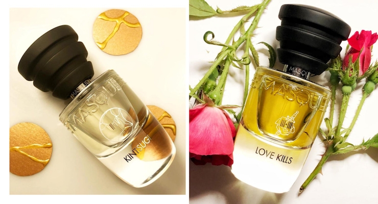
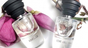
Italian perfume house Masque Milano recently unveiled a duo of luxury unisex fragrances inspired “by the dynamism and various acts of the opera.”
Kintsugi is inspired by a Japanese art, of the same name, in which broken pottery is repaired with a lacquer mixed with precious metals. The thought: “Cherish the simple. Cherish the old. Do not hide your scars, show them with pride.”
Love Kills imagines perfumer Caroline Dumur on the stage of an opera, “with the spotlight on the quintessential flower of love: her majesty the Rose,” and the flower’s beautiful notes.
Because the packaging is so intriguing, Beauty Packaging wanted to know more about the design, so we reached out to Alessandro Brun, founder of Masque Milano Artistic Fragrances, who says, “Packaging is one of the aspects of Masque Milano we are proud of.”
Here, an exclusive detailed explanation from Brun, as told to Beauty Packaging:
“Let me first of all remark on some of the guiding principles of Masque Milano. Masque Milano is a niche Italian perfumery brand, which I established with my partner Riccardo Tedeschi in 2010, after a few years of joint research.
We based our success on a strong brand concept (the Musical Opera) and quality of materials (perfumes and packaging).
In particular, one of the key assets of our brand is the Made in Italy designation—glass bottles made with custom molds by Bormioli in Parma, one of the historical Italian glass companies.
Round boxes made by the undisputed experts in hat boxes for luxury brands, Cavalieri e Amoretti. Stoppers made in wood by an artisan near Milano. And of course, bottle filling and packaging by hand are done in Milano.
These companies are suppliers of the most coveted brands around the world, and the synergy created by having them working on the same bottle is so powerful, that anyone can realize how ‘different’ Masque Milano products are.
Packaging Design
We introduced the new packaging design in 2016, modernizing and improving the previous design while keeping all the iconic elements of the early-years’ design.
Why did we develop a custom bottle (having to pay for a mold), rather than using an off-the-shelf standard bottle available on the market? We are of the opinion that all top niche fragrance houses should have their own signature bottle.
Think about Andy Tauer …and his Pentagon. Villoresi? Hexagon. L’Artisan Perfumer? Heptagon.
Now Masque has its signature design—with the three parallel horizontal lines already characterizing our previous cap.
The new bottle is designed with a very thick glass bottom, to convey the feeling of luxury.
At the same time the format and the tapering shape allow the bottle to nicely fit in a person’s hand.
We also improved the atomizer—now pressing the button you can notice a very long and steady spray: tinier molecules spread around on a much larger cloud, literally ‘overwhelming’ your whole body (if you want!) in the fragrance with a single spray. The new caps are made in wood, by a wooden artisan in a tiny valley in the Alps, in northern Italy.
To please photographers, we also made an additional small investment in terms of how we depict the required information at the bottom of the bottle. We avoided the classic label (which is the cheapest way to proceed) which – even if transparent – could be evident through the glass. We discussed with our trusted decorator, and we opted for a serigraphy in silky white ink (nothing new - actually the supplier doing our decoration is already realizing the same type of ‘almost invisible’ decorations for Chanel bottles).
Technically it is written – thus compliant with regulations – but it’s not too prominent. These are all minor things, but they certainly contribute to the overall image conveying an idea of extreme, superior quality in whatever we do.
We also hired a designer to create the new fonts for our logo. It is a custom font, inspired by the sans serif fonts of the 1920s, which makes the MASQUE MILANO logo very readable and with a modern twist.
Small Illustrations
A final, important remark: The packaging contributes to the storytelling of the Musical Opera.
Every fragrance is a ‘scene’ in the scented opera of life. and every scene is depicted through a ‘tale telling’ name (Russian Tea, Times Square…), a brief description, and an illustration.
All our bottles are decorated with a little illustration meant to be the visual representation of the fragrance’s essence.
For instance, we conceived the idea of the Russian Tea fragrance while enjoying a Russian Tea Ritual in the café of an art-noveau library in St. Petersburg. So we gave the designer a few pictures of the building, and he carefully studied the wrought-iron gate at the entrance and used a detail to create the illustration for Russian Tea.
The design used to decorate L'Attesa bottles was inspired by a famous Dali painting— the pleasure of the meeting is melting with the pleasure of waiting for somebody – it is reflected in the image of a liquefying watch. And what looks like a tiny watch chain is actually inspired by the trailing bubbles in the champagne.”
Masque Milano fragrances are sold in New York at the all-sensory tasting room, retail lab and incubator Perfumarie. (Follow @DearPerfumarie on Instagram.)

