Vita Raykhman 07.25.18
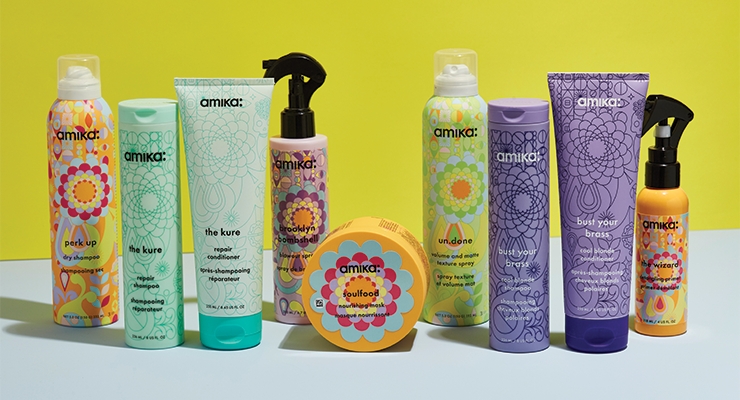
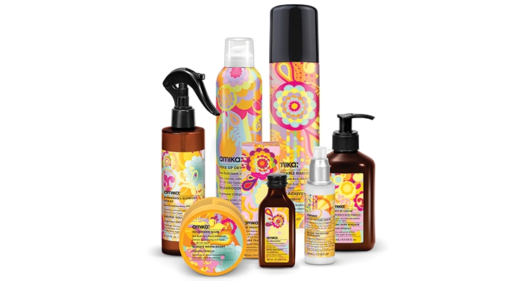
amika was founded in 2007 in Brooklyn, NY, and offers a range of professional hair products and tools that encourage creativity and promote healthier hair. It has always been in our DNA to change and evolve, thus the packaging update was a natural progression for amika. The brand first launched with a collection of hair tools, which expanded to include styling and wash products several years later. The product collection was small at first and the packaging was designed in similar style to form a cohesive collection. However, as the line expanded, it became increasingly difficult to differentiate our shampoos, or our aerosols, from one another. On their own, the products looked great, but as a group, the collection became challenging to navigate—both for the consumer and the professional stylist.
The packaging relaunch was designed entirely in-house, a process which took about three years to complete. amika’s signature pattern, seen throughout the entire collection, is extremely well known and I wanted to stay true to this design with the new packaging. The pattern is very intricate, so for the shape of the bottle itself, I knew it had to be rather simple and streamlined. The original pattern was created almost a decade ago, so the relaunch gave us the opportunity to infuse the newer symbols that we brought into the line over the years into the new packaging—including amika’s signature skull, which is now hidden within the pattern.
The new packaging is color categorized by the product’s key benefit or principal usage, and we now have nine collections that the products are separated into, including Volume, Repair, Blonde and Curl. Adding a variation of color to amika’s signature pattern for each collection not only differentiates the products in our line, but additionally works to elevate the aesthetic of the brand and creates a design that really stands out—looking like no other competitor out there. It also gives the line a “collect them all” quality.
I designed a custom cylindrical shape that is reminiscent of a baton, and is subtly unique, as it’s slimmer than the standard bottle. A baton represents collaboration, and this shape evokes the inclusive, approachable nature of the brand—as the name amika itself means “friend” or “girlfriend” in several languages. There was also an opportunity to elevate and play with the sensory experience of holding the bottle, so it was important to have all the packaging soft-touch. The updated packaging better reflects our aesthetic and mission for a lifestyle of self-expression and hair rebellion against conformity and the mundane.
About the author:
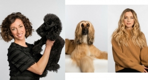
Vita Raykhman is amika’s co-founder and creative director. (Photo credit: Aaron Weiss)

