Jamie Matusow, Editor-in-chief01.30.19
Late in 2018, in anticipation of a holiday shopping frenzy, social media analytics firm Influenster revealed the results of a poll they had done on “Most Wanted Makeup Brands on Black Friday and Cyber Monday.” The outcome: The majority of survey respondents said they were planning to purchase makeup during the holiday kick-off period. The No. 1 choice of these Millennial and Gen-Z consumers: tarte cosmetics.
Yes, tarte with a lowercase “t,” which came about because founder and CEO Maureen Kelly, tells Beauty Packaging: “I’ve always wanted it to feel fun and laid back, just like the brand itself—and lowercase letters helped demonstrate that informal and approachable vibe that tarte stands for.”
a language of its own
Also adding to the prestige brand’s casual vibe are a number of descriptors, including several registered trademarks—all lowercase terms to emphasize tarte’s appeal—from its devoted customers to its unique ingredients.
tarte calls its fans and customers “tartelettes.” Kelly explains: “There’s no age or limitation to being a tartelette—but we define them as beauty trailblazers who are fearlessly confident, shamelessly fun and not afraid to be unique.” Additional trademarks include “real results for real women” to encompass people of all types; “mermaid skin;” tarteist; and “skinvigorating” to define formulations known for their healthy ingredients, which include Amazonian clay, rice bran wax, carnauba wax, olive esters, provitamin B5, Vitamin C, Vitamin E, mineral pigments, algae and marine plant extracts, glycerin and others.
The brand was the first to market products that contain Amazonian clay (harvested from the banks of the Amazon River) and maracuja—not only in skincare, but “infusing it into color was a big deal,” according to Anna Sponaugle, tarte’s executive director of product development. She explains, “We’ve always taken this makeup-with-skincare-benefits approach and it’s really exciting to be innovators in that category.”
In fact, Kelly says, “We believe in breaking down beauty boundaries (things we feel hold our confidence back), shattering stereotypes, and being kind. We believe in high-performance and natural. We believe in artistry and good-for-you ingredients. We never compromise when it comes to what we put on our skin and neither should you. You shouldn’t have to choose between beauty that works and beauty that’s healthy.”
how it all began
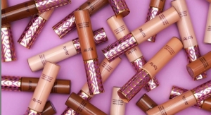
tarte was the breakout Indie brand of its time nearly 20 years ago, when Kelly perfected a good-for-your-skin color cosmetics formula in her New York City kitchen and packaged it in an easy-to-apply push-up tube. After pounding the pavement and knocking on beauty editors’ and buyers’ doors, she succeeded in debuting her product on counter at Henri Bendel. A deal with QVC followed—and the rest is history. Today, two decades later, the brand retains much of what it stood for at launch, with Kelly at the helm (although in 2014, Japanese cosmetics giant Kosé acquired 93.5% of the brand for a reported $135 million). Formulas presented in creative, covetable packaging remain the No. 1 priority. The brand is especially deft at relating primary and secondary packaging through decorative elements including colors, patterns, textures and design, delighting tartelettes multiple times with each purchase.
Forging a path ahead of the industry, the brand pioneered not only with cosmetics that have skincare benefits, but in areas including social media, cruelty-free vegan formulas, special editions and quick-to-market multiple launches. And of course, captivating, fun packaging designed for social sharing—including with the savvy brand’s 8.8 million Instagram followers.
Kelly put the marketing puzzle pieces together early on and says, “We’re a social first brand. We were early adopters to Instagram and I view it as a way to connect with our tartelettes on a more intimate level. It’s amazing to get real-time feedback on new launches and answer questions directly. We’ve also embraced social influencers—it’s incredible to see them demonstrate their artistry with our products. Social media is the new-age word-of-mouth and it’s allowed us to reach a wider audience.”
tartelettes are also privy to special deals, special shipping and delivery, and more.
packaging for chic, glam
From the beginning, packaging has played a major role in tarte’s recognition and success.
According to Mylan Nguyen, senior analyst at Euromonitor International, “There is no doubt that packaging plays a big role in making tarte products more desirable. The colorful and varied range of packaging makes the brand stand out, especially in the clean color cosmetics arena. Indeed, tarte cosmetics products are not only stylish and fashionable, they are also cruelty free, dermatologist tested, vegan friendly, hypoallergenic and formulated without parabens, mineral oil and phthalates, among others. While such clean positioning is emerging in color cosmetics, this remains rare for brands and tends to be applied to a limited number of products rather than their whole product range, such as for tarte.”
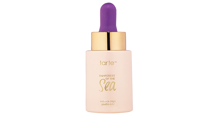
Most of all, says Nguyen, “tarte is a highly visible brand on social media which certainly contributes to their popularity. While their products’ packaging has been designed to be highly Instagram-able, the brand also uses features and materials that stand out such as a wooden cap for their Amazonian clay foundation range or a dropper for its rainforest of the sea radiance product, rather than a lotion pump, for an extra wow effect.”
Gina Rokose, award-winning package design director and adjunct professor at Pratt and City Tech, NYC, agrees. She says, “Known for its exciting, eye-catching packaging in the color cosmetics category, tarte continues to burst with surprises this season. As always, the brand is invitingly unique, universally appealing and modern–perfect for busy women looking for innovation and easy application. tarte’s social media also continues to support diversity and beauty via strong visuals of their impactful packaging. Exciting product shots attract consumers while engaging their influencers.”
How does the team approach product development? Which comes first—the formula or the packaging?
“It could be either,” Sponaugle says. “It’s really dependent on whether we love a formula or love a packaging option. We try to remain flexible and if we love something, we’ll carve our own path and process to make it work.”
The formulation came first with the brand’s first product—the cheek stain, as mentioned previously. Kelly says the packaging “was inspired by those nostalgic ‘push pop’ ice cream treats. There wasn’t anything like it on the market—a straight-to-cheek applicator where you could just smile, dot, and blend with your fingers. Plus, I love that it was travel-friendly, didn’t break and one little tube lasted forever.”
Kelly had found a veritable white space in the beauty market—and packaging became a focus.
She says, “Packaging is actually a huge part of what inspired the brand. Not only could I not find formulas with naturally-derived ingredients that lasted throughout the day, but the packaging in that space was not glamorous at all. So I focused on finding and creating chic, glam packaging. Because that’s what every girl wants, right? Something that’s healthy, something that looks good, and something that will last. It used to be something that people would love to pull out of their bags and share with their friends. Now, I think about how products will look and come across on social media, and packaging is a big part of that. Is it eye-catching, does it effectively represent the product and show the innovation? All are things that the team thinks of while in the development process.”
Kelly says they started with a lot of purple in the beginning “and while we still use purple and it’s tarte’s signature color, it’s used as more of an accent color these days.” She says they try and stay on trend whether that means using the Pantone “color of the year” or generational shades like Millennial pink. “We’ve also been able to evolve with fashion trends—we used a lot of rhinestones and fabric in the past—now we have a sleeker feel with more metallized palettes,” says Kelly, adding, “also, most of our palettes are magnetic so you can customize and mix/match your favorite colors.”
Throughout the years, tarte has maintained its position by tying the line together while always developing new and fresh ideas. In addition to the use of different shades of purple, the tarte logo font has remained the same since launch. “Aside from that,” says Kelly, “we try to remain innovative, while weaving in natural elements and being flexible to what the market and consumers are requesting.”
In a lot of tarte palettes (blushes, bronzers, highlighters, and metallic shadows) tartelettes can pop the pans out to create their own custom palette, using the depotting tool sold online.
more than 100 launches in 2018
With tarte’s commitment to constantly engage and delight its tartelettes, frequent product introductions are a must. The brand had more than 100 launches in 2018, with many of them complex and challenging projects. Production relies on the use of both custom and stock packaging components—as well as customizing stock for a distinct look.
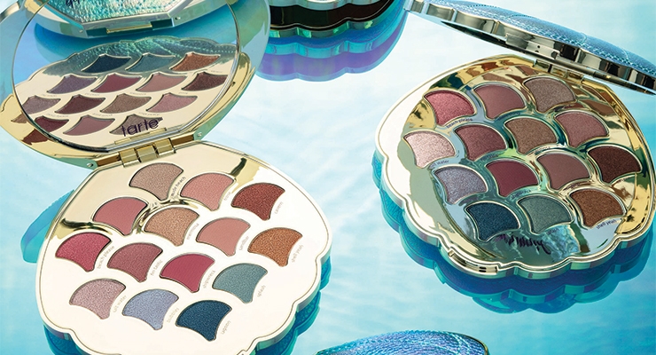
When it comes to custom tooling, Erica Hillmann, director of creative services, points to tarte’s summer collection “as really innovative and challenging.” She tells Beauty Packaging: “It was mermaid themed and Maureen and I wanted to create a palette that looked like a giant seashell. But we didn’t stop there. Not only did we mold a 3D shell, we completely wrapped it in shimmery fabric. Similar to our mascara, the fabric had to cover a curved surface, which is very difficult to achieve. The final product was incredible. The packaging team worked on eight different models of the compact—we needed to balance the shape, weight, and fabric inlay—as there were ten individual parts that needed to work together perfectly to create this design.”
The be a mermaid & make waves palette is a favorite of Daniel Kiyoi, tarte’s creative director. He comments, “Yes, creating a custom palette that looks like a holographic mermaid shell is as challenging as it looks. While the distinct shape and mixed materials took some time to perfect, utilizing both metallized plastic and fabric helped to set this palette apart in store. Plus, the shell-shaped pans on the inside kept the theme going.” As a special touch, this palette also has “99% mermaid” scrawled on the mirror. Words or phrases appear inside other palettes, too.
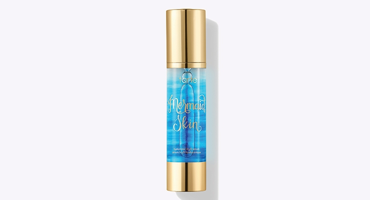
Rokose says she also admires the packaging for tarte’s mermaid skin hyaluronic serum, saying, “The sea blue coloration capitalizes on the hot aqua trend by creating luxurious watery effects on a classic pump bottle. The overall package is irresistibly appealing for anyone who wants to channel their inner mermaid while they hydrate and preserve their skin.”
perfecting the details
Associated with the mermaid collection is a limited-edition mermaid lash curler. Kiyoi explains the innovation and the challenges: “Even though we wanted the handles to look like an adorable mermaid tail, we would never compromise the performance of the lash curler itself. To ensure a proper curl we had to iron out details during the engineering phase.” The shape and design of the tail handles were challenging because the angle of the tail curve had to be positioned in relation to the handle length to optimize proper pressure and lash curl. The packaging team ran through five design phases of the handles to optimize all details. We had to make sure it was perfect,” he emphasizes.
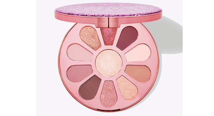
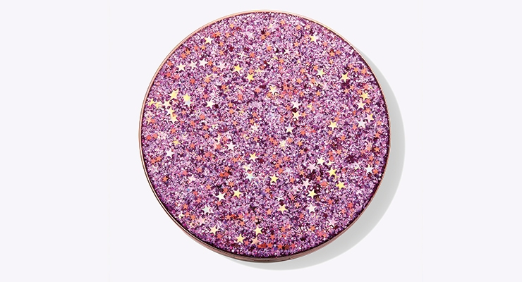
Another highlight of the year: Hillmann says the packaging team considers the limited-edition love, trust & fairy dust eye & cheek palette “our undercover innovation of 2018 and our best use of customizing a stock component through decoration.” This compact design changed at the last minute to have a suspended glitter 3D effect. In thinking about objects with a suspended glitter effect, Hillmann says the team thought of resin paperweights with suspended glitter, petals, or other objects. But it wasn’t easy to accomplish.
“Initially our supplier said it couldn’t be done,” explains Hillmann, so we looked up videos on YouTube to see how people were making two-part epoxy paperweights at home and suspending glitter in the domes.” Hillmann says they shared this research with the head of tarte’s Hong Kong office, who worked with the supplier on a daily basis to push them to find a way to industrialize this process for a compact insert—looking up processes used in home goods and partnering with them to make the epoxy discs for the compact cover. Even finding the glitter that the team wanted was a challenge, but being short on time, the tarte team sourced the correct glitter so that the supplier could focus on the epoxy discs. “This partnership with our component supplier was done in record time and the process from concept to industrialization was defined in less than one month,” Hillmann exclaims.
Adding fabric and embellishments to packaging is a tarte specialty, and one that contributes to Kiyoi’s saying, “I think we had a lot of cool innovation this year, specifically fantasy elements.”
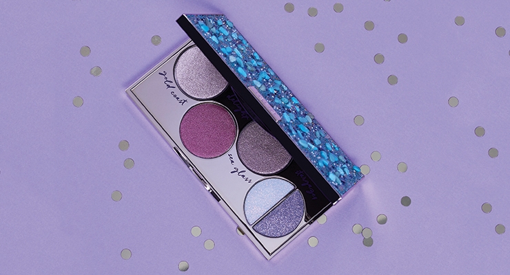
Aside from the mermaid collection, another standout for Kiyoi is the foil finger paints shadow palette. He says, “This palette turned out so beautiful. We added a recess to the cover so we could incorporate the custom beaded fabric. Meanwhile, the dimension from the stones added a completely custom look. The combination of fabric with custom-tooled and stock packaging was a major theme for us in 2018.
designing for flexibility and speed
Embellishing packages with fabric and stones has enhanced tarte’s abilities to issue fresh products in a timely, speedy manner.
A number of tarte’s products are designed to have interchangeable pieces that can be switched out in order to keep up with trends or release a limited-edition version. For example, Kiyoi says, “Our best-selling mascara is covered in fabric, which is sewn and glued onto the inner component. We can easily update it with new fabric to make it feel special and new. Many of our eye palettes have top inserts that can be made in almost any material; paper, plastic, fabric, wood. This allows us to create unique designs, but also be quick to market.”
But quick-to-market launches aren’t tarte’s only goal, as the brand also prides itself on the quality and details tartelettes can’t get enough of.
Kiyoi says: “It’s important that we’re always leading trends in the marketplace, which requires that we work with very fast timelines. We can’t just be fast though—in order to truly stand out, we need to be able to customize and push out of our comfort zone while still maintaining the quality product our consumers expect from us. This means we need to be fast, agile, and have an extreme attention to detail, which can be challenging but it’s something we thrive on. It also means that we need to be open and flexible to change, and adapt to it as quickly as it comes. Every one of the palettes we created last year really pushed us—design, packaging, suppliers—from concept to execution, whether it was through custom tooling, individual design, or unique use of materials.”
adding a twist to favorites
Even favorite products don’t necessarily stay status quo. Based on feedback from tartelettes or when tarte finds a better applicator or dispenser, the brand will make a revision.
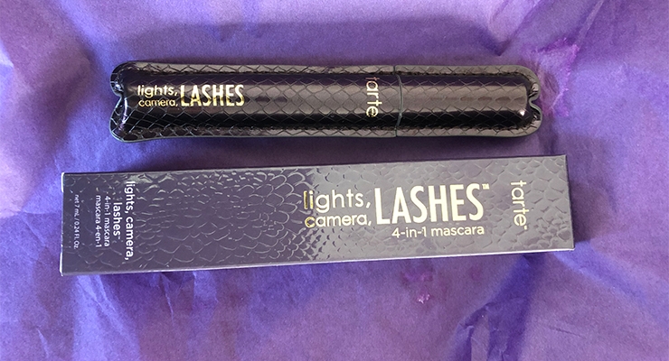
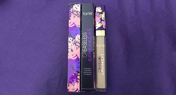
This was the case with the best-selling maracuja creaseless concealer. Kiyoi says: “In 2018, we wanted to update the concealer to a more user-friendly doefoot, so we moved from a tube to a stick pack for easier application. It has a three-color silk screen design running 360 degrees around a soft square cap which was challenging, but proved to be a success with our customers for both use and overall design. We also updated our iconic lights, camera, lashes 4-in-1 mascara with limited-edition patterns and prints to align with our seasonal themes. Customers were thrilled to see a classic get a makeover.”
what’s coming down the tarte pike?
With so many successes and a year of 100 product launches, what can we expect from tarte as it heads toward its 20th anniversary? What’s next? Additional SKUs? Categories? Fragrance? New packaging?
Kelly enthusiastically responds: “All of the above! We want to do things in all categories—from skin to color to fragrance. We’re always looking at products that the tarte team personally wants to make our lives easier and we’re constantly learning about new areas and innovations—we’ve done pearly girl teeth whitening treatment, hair goals dry shampoo, knockout skin tingling treatment. We’ll continue to challenge ourselves and want the packaging to reflect our brand. We use all types of elements so you’ll never see the same thing from us.”
—Erica Hillmann, director of creative services: “Lights, camera, lashes 4-in-1 mascara. We stood out in this category from the beginning because it was wrapped in fabric, which was unusual in the market. And today we’re able to reinvent this mascara by dressing it up in limited-edition prints and having fun with it.”
—Anna Sponaugle, executive director of product development: “I love the foil finger paints shadow palette because I like incorporating fabric into packaging—it gives it texture and makes it unique. The fabric and the stones added a cool, natural-feeling sea-inspired element.”
—Daniel Kiyoi, creative director: “I love our tarteguard 30 sunscreen. It’s a glass bottle covered in a rubber sleeve. The glass makes the product feel more luxe and the sleeve adds the fun! It’s perfect for a sunscreen because it looks like the bottle is wearing a wetsuit!”
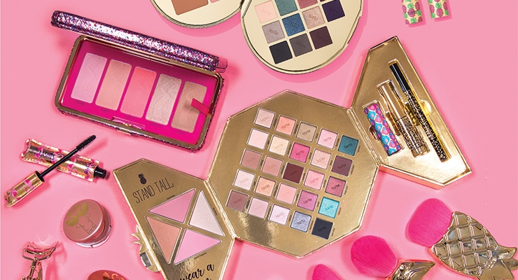
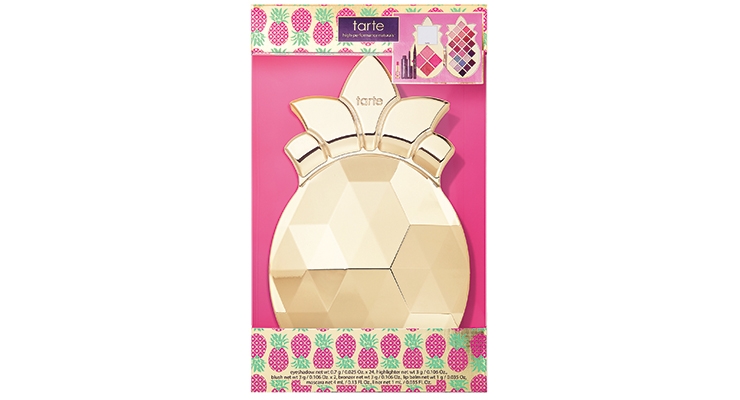
For Gina Rokose, award-winning package design director and adjunct professor at Pratt and City Tech, “A true packaging standout this season is tarte’s pineapple of my eye collector set filled with everything for a complete makeup application. Big and shiny, this faceted pineapple-shaped compact is a visual delight yet lightweight and highly functionable. A true work of art, it is comfortable to hold and has a built-in mirror for on-the-go applications.”
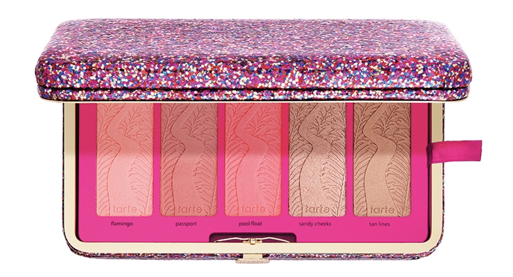
Another standout for Rokose is the life of the party glitter clutch—a dazzling glittery clutch that houses a removable tray of five blushes. The lid has a mirror and slots to hold credit and business cards. Remove the tray to find plenty of space for your other party essentials, such as cell phone and lipstick. A must have for the holiday season!”
• pineapple of my eye collector’s set
• life of the party clay blush palette & clutch
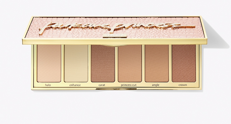
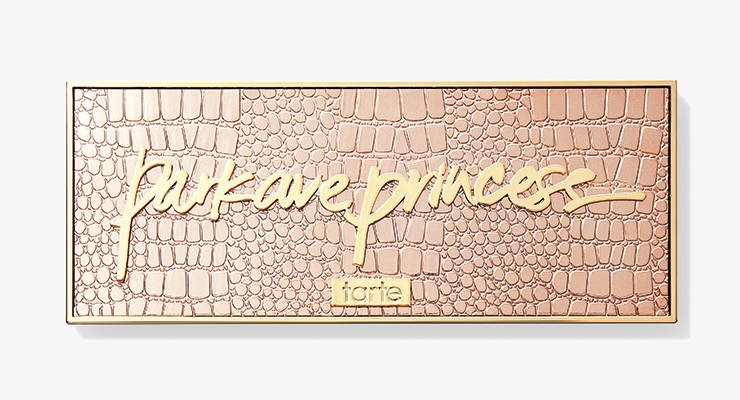
• park ave princess chisel palette
• knockout tingling treatment
• tarteist pro remix Amazonian clay palette
• busy gal brows tinted brow gel
• creaseless concealer in a variety of shades
• h2o gloss in a variety of shades
• chrome pot in: beach babe, sun drenched, martini, frose & fire dancer
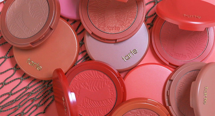
• Amazonian clay 12-hour blush in dazzled & peaceful
• lights, camera, lashes 4-in-1 mascara
• gifted Amazonian clay smart mascara
• tarteist lash paint mascara
• mermaid skin hyaluronic H2O serum
• blush 101 Amazonian clay blush palette
• blemish bully acne spot treatment
• tarteguard 30 mineral powder sunscreen broad spectrum SPF 30
• maneater self-sharpening eyeliner
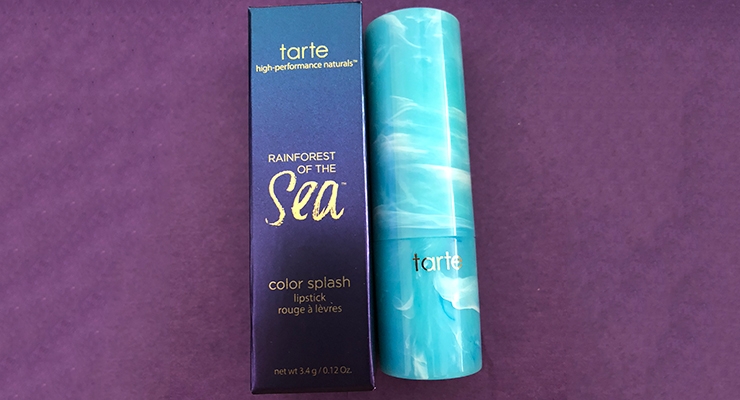
• color splash lipstick in a variety of shades
• quench lip rescue in a variety of shades
• quickie blending sponge
• drink of h2o hydrating boost moisturizer
• tarteist quick dry matte lip paint in a variety of shades
• toast to the good life eye brush set
• rainforest of the sea 4-in-1 setting mist
Nick Vaus, partner and creative director, Free the Birds, offers his comments on tarte, from across the pond, where the brand is now much more widely available.
“It’s interesting commenting on tarte from the UK,” says Vaus. “Until last year, it was only possible to buy just a few SKUs via QVC, so it was very much a ‘check it out when you’re in Sephora abroad’ brand. Now with tarte shipping to the UK directly, it’s far higher on everyone’s radar. And looking at the brand design and communications, it’s not surprising that it charms beauty fans, both consumer and professional.
First off, if you didn’t know the long-standing cruelty-free, vegan and natural heritage, you’d be pretty surprised: It certainly doesn’t play in the traditional ‘worthy’ natural space. Instead of green, white and plant-based cues, you get aspirational glitz and glam in the core brand colors of purple and gold with playful typography and naming (setting it apart from the edgier, more gothy Urban Decay).
Indeed, the key brand colors provide consistency to what could otherwise be a bit of a mish-mash of different colors, patterns and structures. Instead, tarte manages to create a sense of wonder and discovery, catering to a wide audience of beauty lovers of all ages in the process: Who wouldn’t want a chunky, beveled gold pineapple eye palette for a present? Its structures in particular, are hugely tactile and ergonomically engaging.
In general, color cosmetics brands are split between the serious, professional makeup world of black, black and more black (NARS, MAC, etc.) and personality brands with more color and verve. However, it’s always a very fine line between nods to mermaids and unicorns, and taking it too far into the cheap and childish and stopping a brand from being taken seriously. So far, tarte walks the tightrope perfectly: The structures have enough heft, elegance and thoughtfulness to stop them looking naff, the naming light-hearted but not silly. A job excellently done, but always something to bear in mind for the future.”

