An eye-catching decoration—and partnering with the right beauty packaging suppliers to achieve it—is a sure way for a brand to connect with consumers. Package design uses visual cues to help a brand capture attention and inspire trust. "The bottle is the silent salesman," says Mark Rosen, package designer.
But, brand relevance is no longer about having the right look, nor is it only about cultural relevance. Edelman explains in its Trust Baromater Report that consumer views have changed. Branding and design 'rules' have evolved, as well.
For a brand to be relevent, equal parts “culture, purpose, and society,” are required, Edelman states—and "trust is the ultimate currency."
Beauty brands are connecting with consumers by taking a stand on important issues, because remaining silent is no longer an option.
Edelman's report states:
“In the wake of the pandemic, there is a further evolution from Me to We. Value, customer safety and putting people before profits have soared in importance, while personal image, trendiness and excitement are down...Nearly two-thirds of respondents say that they are more attracted to brands that focus on making the world a better place.”
So if a beauty brand intends to stay relevant, it needs to care about what consumers care about—and show it.
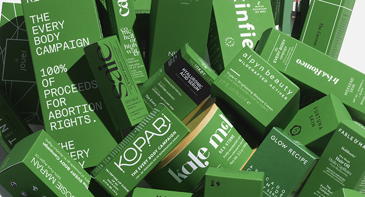
Eco-conscious packaging, with decorations that won’t interfere with recycling, is one way for brands to meet sustainability goals, while also aligning with a cause consumers care about—saving our planet.Saie's founder, Laney Crowell, was inspired to rally support for a cause—reproductive rights. The indie brand has decorated its cartons with a message, and recruited 37 other beauty brands to do the same for its Every Body campaign, reports Forbes.
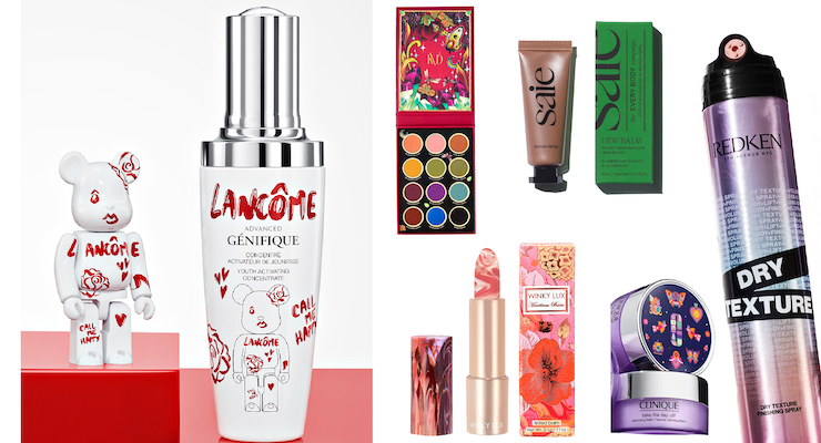
Lancome aims to "spark joy," while Winky Lux's founder says its mission is to spread positivity. Both are accomplishing this through design—and playful packaging.
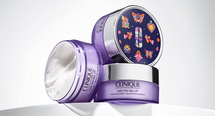
KVD Beauty and Clinique both partnered with artists to feature artwork on its limited edition packaging.
Redken's team recently redesigned its entire hair collection. Now, product names are highlighted on packaging as a design feature.
Photos in the slider above show these brands—and scroll down for more about each of these brands created these looks.
No matter what your brand aims to convey to consumers, partnering with the right suppliers will help achieve your design goals. We spoke to a few skilled packaging suppliers serving the beauty industry about their decorating capabilities and design trends.
Decorating Insights from Beauty Packaging Suppliers
See below for insights on specialized decorating techniques, and tips on finding ways to balance luxury and creativity with eco-conscious solutions.What are some on-trend looks for beauty packaging?
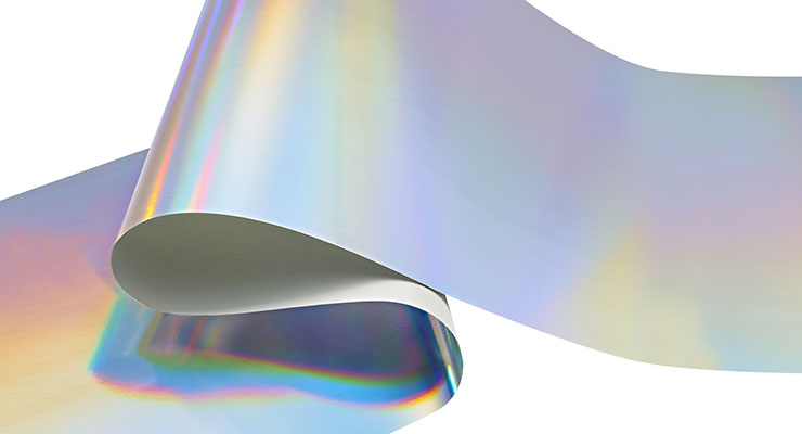
One supplier of packaging materials, Case Paper, says most of its customers are interested in its silver holographic laminates. The supplier’s laminate division, Case Makes, offers its trademarked LuMet in silver, rainbow, and a wide variety of holographic patterns for a high-shine decoration that is an eco-friendly alternative to conventional aluminum foil and film laminates.“It is certified as ‘fully recyclable’ from the University of Western Michigan, and offers unlimited design options since it can be printed, stamped and glued,” says Gregg Olah, sales manager of specialties at Case Makes.
Suppliers say balancing the need to be eco-conscious with a luxe look is often a concern.
“Beauty brands are prioritizing sustainability goals, even for holiday sets and limited-edition launches,” says Joe Cicci, president, COII Packaging. Eliminating plastic vacuum form trays from a luxury gift set box is one way to be more eco-conscious. “Brands often replace these with fluted platforms,” says Cicci. The team at COII developed a process called “Auto-Mask,” which hides the fluted material and can match it to a carton’s graphics.
Cicci says decorating a package using hot-stamping and cold-stamping processes can be more eco-friendly alternatives than covering a substrate with a film. On cartons, COII Packaging often combines stamping with its “Lustre-Look” process. “It minimizes the foil portion, while adding metallic areas for a luxe look,” he says. “We work with customers to find sustainable solutions that sparkle, without using effects such as glitter, to produce eye-catching designs that are also eco-friendly,” says Cicci.
ScreenTech/SprayeTech sees a rising demand in spray coating and screen printing. “Our spray business is continually growing,” says the company’s president, John Schofield. Schofield’s team is busy fulfilling requests for both matte and satin spray finishes. “Many brands also utilize our UV-inhibiting spray additive,” he says.
Decorating processes for glass that are eco-friendly
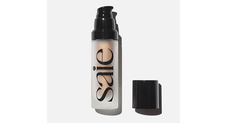
Many beauty brands, such as Saie, are opting for glass packaging, and working with suppliers to ensure that the decoration they choose doesn’t affect the package’s recyclability.Schofield sees a rising interest in glass packaging. “Beauty brands frequently choose glass bottles because they are infinitely recyclable,” he says. The supplier uses its eco-friendly water-based sprays to achieve different effects on glass. “This look is luxe, and the package remains completely recyclable,” he says.
New High Glass also fulfills many requests for spray decorations. “We are currently developing our next spray line, which will use UV-cured coatings,” says Dave Desai, vice president of sales & marketing.
“None of our processes affect the recyclability of the glass,” he adds. New High Glass provides decorating services in-house. “We wanted our processes to be both state-of-the-art and sustainable. For our spray-coating line, we are utilizing water-based organic spray coatings, which are solvent-free,” Desai says.
New High Glass’s screen-printing process uses only UV-cured organic inks. “Pairing our UV-cured organic inks with a pre-treatment process and specialized printing equipment makes it possible to print multi-colors in a single pass without an energy-intensive post-cure,” Desai explains.
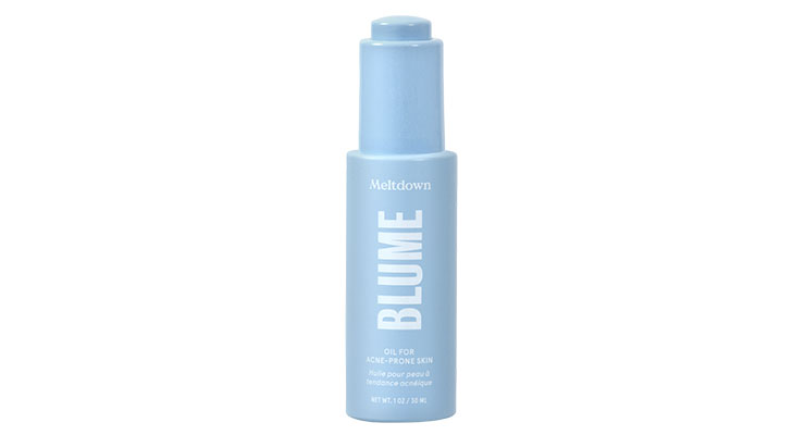
Virospack decorated a glass dropper pack, which it supplies turnkey, for the Gen Z brand, Blume. The brand’s Meltdown Acne Oil is sprayed with an opaque baby blue finish. “We used spray-painting and silk-screening processes,” says Rosa Porras, marketing communications manager, Virospack.
Virospack’s electrostatic paint facility offers brands decorated glass in a range of opaque and translucent colors, in both bright and matte finishes, using water-based paints.
“We recently incorporated an aerographic spray painting line, which allows us to produce any special effect on glass and plastic, from degradé to a pearly finish,” says Porras. Virospack has two automatic metallization lines with a production capacity of 40 million pieces a year, including a newly acquired sputtering metallizing line.
Specialized machinery for hot-stamping & more
Decorating cosmetic packaging requires specialized machinery, and Tapematic USA is a leader in providing UV varnishing, metallization and decoration equipment. Recently, the company added its IDM II In-line Hot Stamping Decoration Module to its lineup.“Tapematic IDM II is designed to integrate into a modular, fully automated line, such as the Tapematic PST Line II. This makes it possible to combine metallization, 360-degree side decoration, top decoration, serialization, and varnishing in unlimited colors and effects—all on one line,” says Tony Denning, president, Tapematic USA.
“With Tapematic PST Line Systems, we offer our customers the opportunity to easily manage multiple decorations with an in-line process. The advantages are evident—dramatic economic savings in staff and material costs, increased capacity, faster changeovers, and a process free of operator variables and intervention,” explains Denning.
Tapematic’s equipment also reduces power consumption. “It is easily 50% to 70% lower when compared to traditional spray coating lines,” he says. The decorative effects that can be achieved using Tapematic’s IDM II include a photoluminescent look. “The parts have a matte metallic finish in daylight—and glow blue-green in the dark,” says Denning.
Beauty packaging can attract attention, whether it's to support a cause, feature an artist's illustration, or spread 'joy'—here are a few notable examples:
6 Beauty Brands Using Design in Various Ways
The right package design makes an impact, and helps to differentiate a beauty brand from competitors.We found 6 beauty brands using design and decoration in interesting ways. See insights from these beauty brands below:
- Redken
- Lancome
- Clinique
- Saie
- KVD
- Clinique
Redken Redesigns Hair Styling Line
Redken recently redesigned its hair styling line to better meet the needs of professional hair stylists, and incorporated more recycled materials.“Our bold new design features post-consumer recycled plastic, modernized names, and a refreshed brand image,” says Candy Gebhart, GM Redken USA. The plastic bottles in the collection are 94% PCR, excluding the pump and cap. “Plus, all Redken production facilities achieved carbon neutrality in 2021,” says Brian Kish, director PPD development.
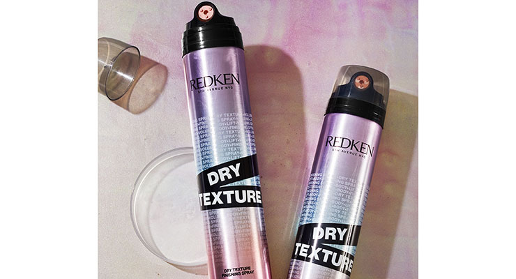
Redken decorates its plastic bottles using labels. “They are BOPP material, and printed with a flexography print process. Depending on the bottle and design, we used either hot-stamping or cold foil for metallic effects—or, lamination for holographic effects,” says Kish. “Our tubes in the collection are decorated using direct-printing, while other bottles and jars feature a plastic pressure-sensitive wrap label,” he says.
Product names are now easily recognizable, which helps stylists quickly grab products in a busy salon environment. “We used color and design to create a more intuitive user experience,” says Kish. “The product names are purposely featured in eye-catching black sashes so that the products are easy to identify on shelves,” he adds. Redken’s Dry Texture Spray, in a metal spray can with a holographic look, is shown.
Lancome Conveys 'Happy'
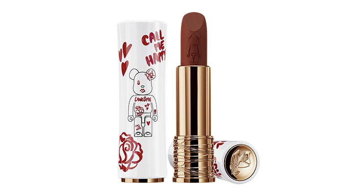
“Happy” designs are a trend, and Lancôme aims to capture consumers’ hearts with its latest design that features a collaboration with Bearbrick. Bearbricks are collectible toys with a cult following created by Japanese artist Tatsuhiko Akashi. The collectible figurines, often in plastic, feature movable joints and teddy-bear-shaped heads.The white custom-designed Lancôme-signed Bearbrick is named “Happy.” It features a bright red pattern that’s meant to look “drawn-on” with lipstick. “The Lancome logo, its rose moniker and the "O" of its name, are all reinterpreted through this irreverent graffiti aesthetic—with its drawn-on mouth, eye, and the tagline Call Me Happy,” the brand states. It aims to “add a daily dose of fun to your beauty routine,” the brand says.
Lancome’s Happy Bearbrick comes in two sizes, and is sold with limited editions of Génifique Serum and L’Absolu Rouge lipstick. The serum and lipstick packaging are decorated to match the figurine. The lipstick bullet is also decorative—it’s embossed with a Bearbrick design.
Winky Lux Aims to Spread Positivity
Winky Lux also aims to spread positivity. Natalie Mackey, the brand’s founder, says that before the team decides to launch a new product, it goes through a “purpose filter” to ensure there is a need.“We ask ourselves, does this create a pop of joy for the customer?” Mackey says. “And if it’s a cool, new ingredient, we ask, do we have a point-of-view on it?” she explains. “Next, we decide how to tell that story in a visual way,” she adds. Mackey says the team always comes up with new designs with this goal in mind, “Can this be packaged in a way that is so pretty you will have to look?”
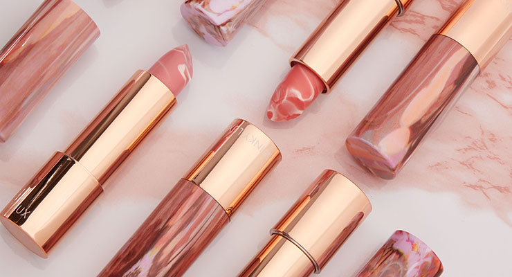
Winky Lux’s Hydrating ‘Marbleous’ Lip Balm features a marble pattern on the lipstick cap and bullet. “Each is a one-of-a-kind design,” says Mackey. The lipstick package is water-printed to achieve the marble effect. “No two are alike,” she says.
The decoration used to create the marble cap is a water transfer printing technique, which uses water pressure to lay out the design on the surface of the cap, Mackey explains. “It’s usually difficult to control the printing if it’s a fixed design, but the process worked well on this cap, which was the ideal shape for this technique due to its curved surface, which showcases the marble pattern,” says Mackey. Metallized ABS completes the lipstick package’s shiny gold look.
Saie Gets Beauty Brands on Board for a Cause
Saie has decorated its cartons with a clear message to support reproductive rights—and the indie brand has enlisted 37 other beauty and wellness brands to do the same. Laney Crowell, Saie’s founder and CEO, created the “Every Body” campaign, which includes a website to showcase the products that are helping to raise funds for SisterSong.SisterSong is a “Reproductive Justice Collective” fighting for reproductive freedom. Participating beauty brands include e.l.f., Versed, Kopari, Pacifica Beauty, and more. One-hundred-percent of proceeds from Saie’s limited edition Dew Balm will be donated to SisterSong.
Many of the beauty brands taking part in the campaign chose products to pair with green cartons, which are printed with information about the campaign. Crowell says she chose green because it symbolizes hope, health and life. It’s also symbolic of the green bandanas worn by pro-choice protesters.
Nearly every brand that joined the cause created a green carton in just six weeks. “Our team worked with 26 of the participating brands to produce their cartons, assisting with artwork as needed. Remaining brands either used a sticker or created their own carton,” says Crowell. “Since they already had their box vector file, they simply needed to tweak the background color,” she explains. The cartons are all printed on Neenah 100 PC FSC paperboard.
KVD Partners with a Tattoo-Artist
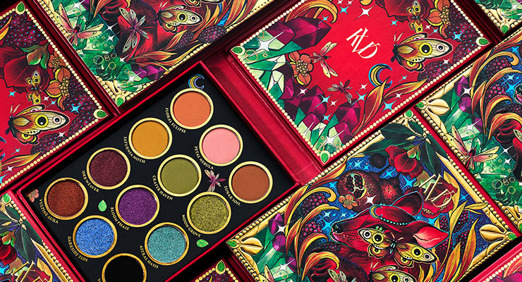
Beauty brands often connect to consumers through common interests. Many fans of KVD Beauty are also fans of tattoos, since the brand’s creator, who sold the company to Kendo, starred on “LA Ink.” KVD’s latest launch is its Moongarden Collection, and the packaging features custom artwork by tattoo artist Miriam Lupini.Lupini is known as the “Witchdoctor of Los Angeles” and she is also KVD Beauty’s global director of tattoo artistry.
Lupini incorporated the colors of the cosmetic products in her artwork. Her design is reproduced on all of the packaging in the collection, including the Moongarden Eyeshadow Palette, shown.
Clinique Commissioned a Mexican Illustrator
Clinique also commissioned artwork for its packaging. The brand partnered with Mexican illustrator Melissa Zuniga to design the packaging for its Day of the Dead Limited-Edition Take the Day Off Cleansing Balm—in anticipation of the need for a makeup remover on the day after Halloween.The jar features the artist’s colorful illustrations on its cap. “They are culturally significant illustrations inspired by the Mexican holiday, Día de los Muertos,” says Sameer Agarwal, VP of marketing for Clinique NA.
“The illustration was printed on an adhesive, which was then pasted on the lid and used to seal the jar,” Agarwal explains. “The illustration and original packaging colors and style blend together seamlessly,” Agarwal adds.
These designs also help increase a brand’s relevance with consumers. “Cultural moments such as Day of the Dead are great opportunities to join and celebrate the Latino community’s rich culture and heritage,” notes Agarwal. The PET jar is recyclable, and the cap features a PP liner with a metal overshell.

